Friday 4 April 2014

Theatrical Trailer | Magazine Front Cover | Theatrical Poster


Evaluation: Music & Sound

One aspect of our trailer that we are particularly proud of is our use of music. The music was composed by James Richardson especially for our film, and we worked closely with him to create just the sound that we wanted. The cello in the soundtrack that takes the melody for much of the duration of the track was played by myself and layered on top of the other layers of music. We feel that the music complimented the film very well, as it evoked by the emotional and physical intensity of the film. There are four main sections to the music - the quiet opening, the intense build up, the mini climax, the large climax, and the calm ending.

The quiet opening sets the scene and establishes the film. It works well with the soothing landscape shots and the silhouettes. This part is played by solo piano and reflects the feelings of loneliness that Lucas Thorne feels at the beginning of the trailer. There is a feeling of calm and equilibrium, which puts the audience into a false sense of security. It works well with the narration over the top - the soothing music mingles with the soft poetry to create a truly epic, yet low key opening. It is very clear from the music that it is the equilibrium and the world is how it's been for a while. However at the same time the narration hints at a darker side to the opening, foreshadowing the horrors that are to come. Some of the visuals also show this, such as the silhouetted shot of someone holding a gun and the shot of Lucas Thorne holding a gun.

The next section of the music builds up to the middle part of the trailer. There is combination of sounds mixed together to create a sort of horror slide that built up the intensity of the scene. This sudden change in tone in the music indicated clearly that something has changed and gone wrong. The audience can clearly see that this section is the breaking of the equilibrium (as noted by Todorov), as the music is harsh and grating. The sudden change also reflects the sudden change in the style of the visuals - from long still landscape shots to uncomfortable jump cuts and Dutch tilts. The sound of the slide was created mostly using a violin, but the piano also supported it. We feel that this was a very successful part of our trailer, as the music and visuals worked in tandem to create the feeling that something has gone wrong.

The following section  begins the main part of the trailer, and establishes the rough outline of the plot. The music in this part is mainly led by the cello; with three cello parts intermingling to create a contrapuntal texture. This is reflective of the intermingling plot lines, where there are several characters all with their separate storylines. This climaxes 1:14, where the storylines of the hero and the villain finally collide, and to match this all the cello parts finally come together and play the same chord rather than their separate parts. This part was also successful, as it didn't build up too much, and left room for the music to build more in the next section.

The penultimate section has the most epic music. It uses the full orchestra (albeit synthesised) to emphasise to the audience that it is coming towards the climax of the trailer. There is less dialogue in this part, as the action just speaks for itself. There is the villain's dialogue at the beginning of the section to establish his character, but after this the only dialogue occurs in one-liners or, at the end, one-worders. The music really drives this final section of the trailer, and it is largely due to the music that this section is so intense and epic.

The final section reestablishes the calm and soothing theme heard at the beginning. This hints at a reinstatement of the equilibrium, but contrasts with the visuals which seems to imply that all hope is lost. This contrast creates an enigma, and leaves the audience wondering what is going to happen - whether the hero will be successful or not. The music is key in this section, as it establishes just the mood that we want to evoke at the end of the trailer, and leaves the audience intrigued to find out more about the film.

In conclusion I think that our use of music and sound was very successful in supporting the visuals of the trailer, and it was one of the key features of the trailer that made it successful. Without the music, the trailer would have lacked pace and emotion, leaving it just a random selection of action shots. If we were to do it again, it would be nice to get a full orchestra instead of synthesised instruments, but this was impractical for us and it sounded amazing nonetheless. James Richardson's royalty free music site can be found at the link below:
http://kingjamesroyaltyfreemusic.blogspot.co.uk

Evalution Activity 2: Director's Commentary

Sync this audio track to the trailer to hear how various genre and narrative theories can be applied to our trailer!


Evaluation: Establishing the Enigma Code

Media theorist Roland Barthes devised a the theory of the enigma code, in which he claimed that the purpose of the author of a media text is to keep the audience guessing through establishing enigmas for the audience to work out. These are conventionally revealed in the final scene of the film. This is a useful tool for a trailer, as establishing enigma codes makes the audience want to find out the answers to the enigmas and go and see the film. In our trailer we have made use of this.

The trailer begins with many enigmas, with no characters being fully shown and the narration leaving the plot line fairly open ended. Instead of revealing characters' faces we show silhouettes and limbs. It is not until right at the end of the opening sequence that the lead protagonist is finally shown, and when he is he is loading a gun, creating another enigma about the reasons for having a gun. Even when he is shown, half of his face is shrouded in shadow, so the audience doesn't see him fully, making him seem mysterious. The narration supports this mystery through the recital of a very ambiguous poem that establishes themes rather than plot points. This is a slightly unconventional start to a trailer, so the audience is drawn in by something a bit different whilst at the end the conventions of an action film are adhered to, to make the audience feel more comfortable. This adheres to Neale's theory of genre, in which he argues that pleasure is derived from 'repetition and difference'. The narration also has some relevance to the film, as it is a poem taken from Percy Shelly's 'Prometheus Unbound', which has a similar title and very similar themes. This is the sort of thing that would excited audiences and could be the start of a viral marketing campaign. Through using this ambiguous poem we interest a wide audience and create an enigma code.

Enigmas are also established later on in the trailer, such as through the action sequences. The audience is left wondering how the characters escape from the situations which they find themselves in. One example of this is at 1:44 when four men in balaclavas advance on Agent Davidson. This is obviously a dangerous and almost hopeless situation, making the audience wonder how he is going to escape. A similar enigma is established at 1:14 when Thorne is pointing a gun at the villain as if he is about to shoot. The audience would be aware that the film can't end there as the trailer wouldn't give that much away, so it creates the enigma about how he is going to escape from that situation. This is obviously established as an enigma, as the music builds up to the moment, making it seem important. Another enigma is at 1:36 where Thorne is seen holding onto Rick as if he's injured. This makes the audience wonder what has happened to Rick and if he's in danger. The trailer also ends on an enigma, with Thorne crawling along injured and then shooting. Questions are raised as to whether he was successful in his shot and who he was shooting. By establishing all these enigmas the audience has a plethora of questions that they want answers to, and they realise that the only way they're going to get the answers is by going to see the film.

Overall we have used enigma codes a great deal in our trailer to pull in a wider audience who want to know answers to the questions we have raised. This is a key part of creating trailers, as if we answer all the questions in the trailer and give too much away then the audience wouldn't have any reason to watch the film. I think this is one of the areas in which we have been particularly successful, as we haven't given very much away at all, and there are even gaps in the general premise of the film which the audience are left wondering about. 

Thursday 3 April 2014

Evaluation Activity 2: Our Marketing Campaign

Our poster, magazine front cover and trailer all worked well together to create a consistent and recognisable advertisement campaign. Each one had a slight twist that allowed the viewer to see the film from a different angle, yet they all had consistent features, giving the audience more reasons to want to see the film.

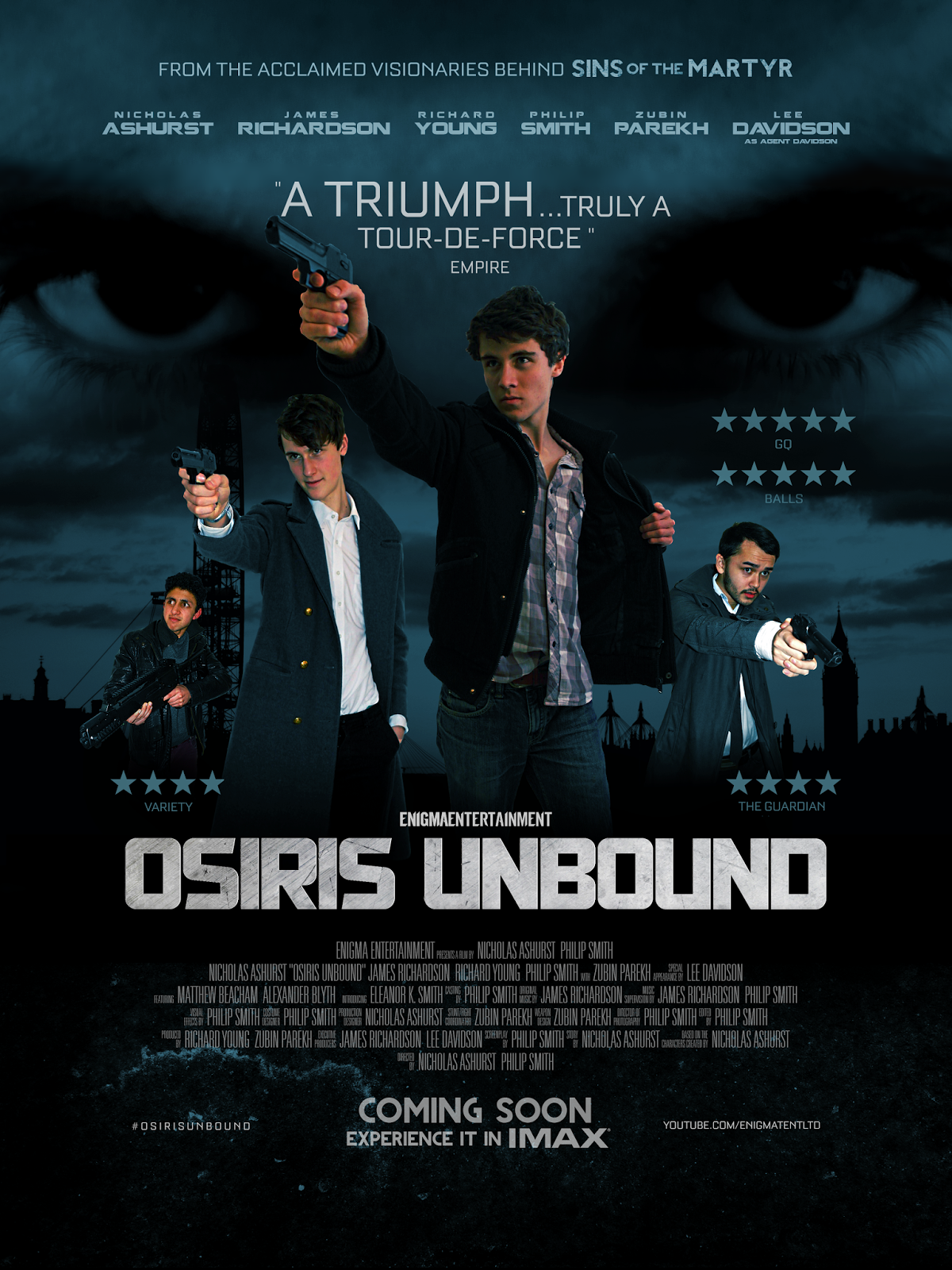
The most obvious way that the campaign linked together was through the establishment that it's an action genre. Each of the pieces of the campaign had guns in, which is a clear indicator of the genre. It was most difficult to make the magazine front cover look like an action film, as the 'Hollywood Reporter' design doesn't show a frame from the film, but instead the actors behind the film. To counter this, we made the actors hold guns and balaclavas and set the photoshoot in a room that is visible in the trailer. This all pointed towards the action genre, and linked the film in with the trailer and poster more. It was also linked by giving prevalence to certain characters; in all three adverts, Lucas Thorne is the biggest/highest/given the most prevalence, followed by Rothen (the villain, played by James Richardson) and finally Zubasu. It is clear throughout the campaign that my character is the main character and we made this even clearer by releasing a special 'character poster' of Thorne, and not releasing a poster of any other characters. By making this clear the audience is able to get to know the lead protagonist more and connect with them, rather than just view them from a distance. At the same time, we focussed a fair amount of the campaign on James Richardson's character Rothen, as the film has a large emphasis on the villain as well as the hero. This is following Claude Levi-Strauss' theory of binary oppositional forces; that stories focus on the conflict between opposite forces, in this case good and evil. To make this conflict clear, our advertisement campaign had a large focus on the villain as well as the hero, and we even released a second magazine front cover with an exclusive interview with the actor playing him. The trailer also supports this theory, as the first half of the trailer has a heavy focus on Thorne, whilst the second half focuses on the villain. Each one has a lengthy speaking role at the beginning of their section, establishing them as the two conflicting forces. In the same way, our poster shows both the lead protagonist and the lead antagonists in similar poses, showing how whilst they're very different, the very nature of their opposites makes them similar. It follows the line in the trailer when the villain says 'we're not so very different you and I, we're both destined for the same damnation, only I'm willing to let the world burn along the way.'

Another way that our advertising campaign works together successfully is through showing the film in different lights. This is particularly prominent in the differences between the poster and trailer and the magazine front cover. The poster and trailer very much focus on the film and the storyline, whereas the magazine front cover's focus is more on the technical, behind-the-scenes side. This allows the audience to get to know the film on multiple levels, from behind and in front of the camera. It makes the audience feel more involved, as if they were part of the process themselves. The poster offers a slightly different perspective than the trailer, as it has reviews from magazines and newspapers at the side, to show its positive critical reception. Neither the magazine front cover or the trailer show this, so it again gives the audience a different reason to watch it - that it is critically acclaimed. This also appeals one of the uses in the Uses and Gratifications Theory by Blumler and Katz (1970), as one of the reasons that the audience might watch it is to talk about it. This links in with our magazine front cover, where the reader can find out more about the film. With these two together, the audience might watch the film to talk about it with friends, both as a critically acclaimed film and a technically interesting film. The magazine front cover also appeals to the gratification of being informed; it gives interesting information on the film that wouldn't be given in the poster and trailer. The trailer on the other hand appeals to the other of the uses and gratifications; it's action packed nature fulfils escapism and entertainment and watching the characters makes them easier to relate to. Through our campaign, we are able to exploit all of the factors in the Uses and Gratifications Theory to create a thoroughly well rounded and appealing film campaign.

The most obvious way in which our campaign links together is through the title of the film. In all three texts the title is very big and bold and the most obvious piece of text (apart from 'The Hollywood Reporter' on the magazine front cover). This is the way in which the audience is ultimately going to be able to identify that they're from the same advertising campaign. On the magazine front cover, the viewer may recognise the actors and the feel of the film, but the text is obvious so that they can confirm their thoughts. In the poster it is also very obvious, so the audience first sees the exciting action in the top half of the poster and then scans down to see which film it is. In the trailer the title is put at the end and is very obvious as it takes up the whole screen. This is a convention of film trailers, as if it were to be put at the beginning then people might lose interest in the trailer before watching the entire piece and then deciding on it. Throughout the campaign the title is reinforced and the brand of the film is made very clear. There are many posters which don't show the film's title and assume the audience know what it is, however this could easily lead to confusion, so our campaign avoids this.

The campaign is also successful as it doesn't give too much of the plot line away. All three parts of the campaign avoid using cliche tag lines, as this would make it seem less 'high brow' and make it seem even more mysterious. The poster in particular leaves many enigmas, something which theorist Barthes considers vital, with the big eyes in the background looking directly at the audience. The viewer may wonder whose eyes they are and why they are shrouded in darkness. The magazine front cover creates enigmas in a different way, as it reveals very little about the plot line at all, just revealing the genre of the film to appeal to the target audience. By doing the magazine front cover as The Hollywood Reporter instead of Empire or Total Film, we have revealed ever less about our storyline, as The Hollywood Reporter concentrates less on plot line and more on the celebrities. The trailer probably leaves the most enigmas, as the plot line is never explicitly explained. The dialogue in the trailer is very vague, with lines such as 'you're not the only one with a stake in this world' avoiding what the 'stake' is. The poem read at the beginning of the trailer begins it with an enigma. The audience is left wondering what the poem has to do with the film, and why it was read out. The poem itself is very unspecific and put out of context (as it is) it could mean almost anything. This makes the audience want to see the film to discover what it means and why it was used at the trailer. However it does also establish some of the key themes of the film, so that they get some idea of what the film it about. The opening is full of enigmas, and the use of lots of silhouettes helps to establish many more riddles.

Overall each part of the campaign works both individually and together to create a rounded campaign that appeals to a wide audience. There are many enigmas established and we have used many theories to help boost the impact of our campaign. Whilst the different parts of our campaign use very different techniques, they are clearly linked together, and make a full cohesive marketing campaign for our film.

Evaluation Activity 3: Audience Feedback 2


 This is the second audience feedback session that we hosted - asking a sample audience of our key demographic to view our trailer and offer their opinons. One of the first points they made was that it looked very much like a Hollywood blockbuster and felt very professional and high budget. This was exactly what we were aiming for, so was clearly a successful part of our production. Another of the audience members commented that it was very 'clean cut' and 'to the point', meaning that we revealed enough of the film to intrigue the audience, but not too much to give away the storyline. We feel that we especially achieved this in the opening with the poem taken from Percy Shelley's 'Prometheus Unbound', which hints at the storyline rather than explains it. The dialogue throughout helped create this enigma code with lines such as 'you're not the only one left with a  stake in this world'; the line doesn't explicitly say what the 'stake' is, but it's clear that it's something big. The same audience member also mentioned that he found many of the shots interesting.

However, it was also remarked by one viewer that they felt the final shot didn't match the music very successfully. They felt that with the slow music at the end, a shot of someone shooting a gun was somewhat inappropriate and they felt it should be a slow reflective moment, with perhaps someone injured or dying. We countered this by saying that the character was, in fact, injured as they crawled along, and the rest of the trailer had had many emotional moments, so the last moment should finish in a more exciting fashion. The other audience members also disagreed with this particular viewer, approving of the subtlety of it and the juxtaposition of music and visuals, so it appears that his is the minority view.

One part of our production that received especial praise was our use of many locations. The viewers were felt that the use of multiple locations in multiple countries gave the film a feeling of 'space', and made it seem like more of a global phenomenon. It was compared to films such as 'Skyfall' in this aspect. We were also very happy with our use of locations, as we had enough so that the film didn't have to keep cutting back to the same scenes, but was able to use a wide variety.

A slight criticism that was noted was that it was sometimes hard to distinguish between the different characters doing the voice over. This is probably because Philip did the voices for two of the characters, none of whom were his own. However, we feel that perhaps this confusion comes from the fact that our sample audience knew what each of the characters were supposed to sound like, so found it difficult to give them Philip's voice. A more artistic reason for the similarities in the voices is that we did it to blur the boundaries between good and evil.

The sole female character in our film, Eleanor, also came under discussion. The audience questioned why she was always seen running, however we felt that this point was rather invalid, as she's only in two shots, only one of which she's running in. To add to this, the one where she's running you don't see her face. However they also asked what role she had in the film and we responded that she was there to conform to the Male Gaze Theory to address a male audience and she also worked as the 'princess' character as described by Vladimir Propp. We also feel there is something of a 'female gaze' aspect to our film, as women would be attracted to our film because of the manly feats that the male characters in the film undertake.

As aforementioned, the audience praised the wide variety of shots used in our film.We were questioned about how we made more characters more prevalent. Some of the characters in the film, such as Thorne, appear many times in the trailer, to establish them as the lead character. However other characters such as Zubasu only appear for split seconds at a time to create an enigma code and make them appear mysterious. At the beginning of the trailer the audience is only shown silhouettes and random body parts, without showing anyone's faces. This creates an enigma code, and makes the audience want to watch on to find out who the characters are. They are finally shown Lucas Thorne, firmly cementing him as the lead protagonist of the film. Later in the feedback session, one of the viewers commented how they wanted to know more about the characters.

Overall the feedback session was very interesting and we learnt a lot from it. We realised more about our trailer than we thought was actually there and it helped us to think through our ideas and why we did some things.

Tuesday 1 April 2014

Evaluation feedback

You have made a good start on your evaluation, with task one completed and four begun. You have applied theories of audience, and considered how your trailer conforms to or subverts generic conventions.

Targets:
Evaluation task 3 - re-upload the audience feedback for your finished trailer - you should sum up what you have learned (positive and areas to develop) in your analysis
Evaluation task 2 - record a voice over/interview style footage where you discuss how the three tasks combine effectively to create a marketing campaign
Evaluation task 4 - what about the software you used to create your poster/magazine cover? Blogger to record your work? YouTube to view other trailers etc? Make sure all of this is discussed.
Remember to also upload any written responses you complete for exam preparation to add to your evaluation

Wednesday 26 March 2014

Evaluation: Uses and Gratifications & The Male Gaze

Our media film makes use of the Uses and Gratification Theory laid down by Blumler and Katz in the early 1970s. This theory states that there are five reasons why audiences consume media products – to be informed and educated, to identify with characters and situations, to be entertained, to be able to discuss the film in a social environment and to escape from everyday life. Three of these can easily be applied to our film, and potentially a fourth. The one that cannot be applied to our film is to be informed and educated, as our film was not made for educational purposes.
The primary focus of our film is to entertain; it’s an action film, so is not designed to educate, but just for the audience to find solace and entertainment. Another of the reasons for which audiences could watch our film is escapism. This is probably the second most prominent of the reasons, as audiences would watch our film to immerse themselves in a world that is distant from their own to forget their problems. The other obvious reason why people may watch our film is so that they can identify with characters. We like to think that our characters are three-dimensional and have vices and virtues that audiences could relate to. The final reason that could potentially be applied to our film is to be able to discuss the film in a social environment. This would probably be the case more for a big budget film, but we establish several enigmas in our film that could prompt discussion.

Another theory of audience that can be applied to our film is the male gaze theory. This states that films are from a male perspective and therefore objectify women. We cast a female role in our film to entice a larger male audience, however she does not have a speaking part in it, leading to the conclusion that she is solely there for the satisfaction of male viewers. The plot never explores her story in much detail, so she is left as a two-dimensional character. The film as a whole appeals to a male audience, as it is high in action and thrills, features that a stereotypicaly male audience would enjoy.

Wednesday 19 March 2014

Evaluation Activity 4: Media Technology


For the editing process we used a software called Adobe Premiere Pro. This software is commonly used in the professional industry so we thought that it was a suitable software to use for our film. It has exceptional colour grading tools, which are very useful in ensuring the film has a professional look to it. It also has very efficient tools for editing titles, which helped greatly and allowed the titles to look as good as possible. I think that one of the key successes to our film was the editing and it was down to this piece of software that we were able to edit successfully. Unfortunately, the computer that we were using with this software was very slow, so editing took a long time. To combat this, we selected all the clips that we intended on using and saved them in an MP4 format to make editing easier, however this did result in a loss of quality so for the key shots - where visual impact was imperative - we reinserted the original format of the files to retain the high quality to the shots. Editing was a very time consuming process.


We used the Panasonic SD90 to film our trailer. I have discussed this in a previous post, which should cover the basics of this camera. The main reasons for using it were that it filmed in HD and had a very good look to it. Admittedly, some of the footage was overexposed and obviously the footage was colour graded, but it did a decent job otherwise. Another fault that we found with this camera was that didn't give the user control over the focus, which prevented us from experimenting with different depths of field. I have learnt how to use the camera to it's highest potential and to avoid trying to do anything that highlights these negative points. We also used two other filming devices for shooting when the camera was out of power or the other side of the world. These were two Samsung Galaxy devices, chosen for their relative ease, though there was less quality to the footage - though only a select few of these shots were used.


The only software used for the design of our posters and magazine covers was the free program Paint.NET. The program was selected for its lack of cost, its accessibility and range of functions as well as several years worth of experience with using it. The program allows the user to do just about all the functions of high end photo editing softwares such as photoshop, but is easier to operate and free.


Blogger was used to record the filmmaking process. This was a helpful tool, as we were easily able to go back and have a look at all our research and planning. It is easy to access as you can get to it anywhere with internet connection, however this did mean we couldn't get hold of it in locations where there was no internet, such as Waverly Abbey and Highgate Cemetery. Blogger allowed us to share links to videos and music files, and was a very useful place to collect and share information.


Other than these pieces of technology we didn't really use anything. We opted out of using a tripod for a few reasons. Firstly, the look that we were going for worked better without a tripod, as it makes the audience feel like they are involved in the action. If it were filmed on a tripod then it would look too static and the audience would feel like they're observing the action, rather than getting into it. The second reason was that it was impractical to set up a tripod in many of the locations as we may have been told to stop filming as we were in public.

Thursday 13 March 2014

Evaluation Activity 3: Audience Feedback


Here is the video of our group evaluation, where we took a sample of media students and asked them to comment on our film, each person looking at a different area. This evaluation was useful in discovering what people thought of our film. It gave us an outside perspective, that we couldn't get, as we'd seen it slowly progress.
One of the first questions that came up regarded the role of Agent Davidson in our film, as he was seen in some of the earlier trailers for the film. This is part of our advertising campaign; Agent Davidson is a character from our last film Sins of the Martyr, so by using him it gives the audience someone to connect to, before introducing them to more unfamiliar characters. The earlier trailer was also more of a character trailer for Lee's character, this is similar to the advertising campaign for Les Miserables in which there was a special character trailer for the character of Eponine. On a more practical side, we hadn't filmed as much with me in it at that point, so we only really had footage with Lee in. Another question in regards to narrative was whether the trailer was chronological or if the clips were completely random. The trailer begins chronologically, showing first my character in exile, followed by his kidnapping, then his rescue, and then the rest of the trailer is an epic mashup of action sequences building towards the climax. Towards the end the clips are more random, but this is simply to reflect the non-stop action nature of our film.
Our evaluators were very impressed with our use of mise-en-scene, especially with our use of costumes to reflect the characters' emotions at certain times. An aspect that they found particularly impressive was our decision to use smaller weapons, rather than big machine guns, which made our film stand out from the generic Hollywood thriller. The smaller guns made it seem like more of a gritty British film, making it more believable. Another aspect of mise-en-scene that was commented on was our use of high-budget locations. Our trailer was filmed across three countries - England, France and Australia, so this gives it a very high production value. In the first 40 seconds of the trailer, there are multiple shots from 14 locations across two of these countries - England and Australia. Famous locations that we used included London, Brighton, the Isle of Wight, Paris, Perth (Australia), Waverley Abbey, Heathrow Airport and Ashtead - to name but a few. This wide range of locations made our trailer look as if it was taken from a full film that crosses many locations. These shots were collected over the course of a year, and there was over 3 hours of footage to select from, meaning that the shots that were included were the very best. This is similar to the way that it would be to create a trailer from a real film.
The amount of footage that we had also helped us to pick good camera shots, which is another aspect that was highly praised. I particularly like the shots that we filmed at Brighton, with the burnt down pier and Agent Davidson's silhouette framing the sunset over the sea. We waited in a cafe until sunset to achieve this shot, and it was worth the wait, as the shots came out extremely well. We were especially praised for our sweeping panoramic shots, such as the shot of the beach in Australia. Additionally, they were impressed by the way the screen flashes to white with the gunshots at the beginning, instead of using a conventional muzzle flash. This was a conscious decision we made to speed up the pace of the trailer.
Something that was questioned was the use of sound effects in the car crash at the beginning; it was asked whether there should be a sound effect of the bullet smashing the glass. This was an interesting comment, as we hadn't really thought about this before, however the bullet could have just as easily gone through the car tire, so we don't think it necessary to add the sound effect specifying where the bullet hit. Also, the only way the bullet going through the windshield would have stopped the car would have been to kill the driver, however in the succeeding shots Richard opens the door and kills the driver close up, so this can't have been the case. Therefore the bullet must have either hit the engine or the tires, and judging from the fact that the car had been going straight before the bullet hit, it must have hit the tires in order to make it swerve off the road. So we don't need a sound effect of the bullet going through the glass.
The evaluation was useful in seeing what we had done well and what still needed work. It raised some questions that we had previously not thought about, and helped us to reassess the effectiveness of our trailer from a different angle. We will have another of these evaluation sessions once the trailer is fully complete; this one was simply to help us see what we could adjust.

Wednesday 12 March 2014

Evaluation Activity 1: Genre


This is a shot that we feel exemplifies the genre of an action film that we have chosen. Zubin's character (Zubasu) is running through a graveyard with a gun - the location, action and prop all support the conventions of an action film, and make it look dynamic and exciting. This is just one shot out of the hundreds of action shots in our trailer. Our trailer clearly exhibits the 'action' feature of the action genre, as the majority of the shots are of action scenes. Admittedly in action trailers they tend to show a few more scenes where not much is going on, just to show that there are moments of calm as well as the action sequences, but in this way we are more unique, as our one shows that our film is almost non-stop action. To help with this action feel, we chose to film the entire trailer without using a tripod or steadycam. Whilst some would consider this to be a bad choice, as it inevitably results in shakier footage, we thought that it helped to make the action more intense and it makes the audience feel more involved in the action. Action sequences, particularly fight sequences, look much less intense with a steady camera, and it takes away from the brutality of the action. Steady cameras glamourise the action and make it look idealised, whereas shaky cameras make it look realistic and brutal. 

Evaluation Activity 1: Characters


Above are some of the characters that are in our film. The characters very much conform to the expectations of characters in action movies, as there is a relatable lead protagonist, an evil antagonist, a badass mentor and a damsel in distress. These characters are easy to understand by any audience, as they are the standard characters in many stories, even in Disney films. For example, in The Lion King, Simba is the relatable lead protagonist, Scar is the evil antagonist, Mufasa is the badass mentor and Nala is the damsel in distress. These roles are seen very often in stories, as they provide a safe platform on which to base the narrative. These characters are similar to those described by Vladimir Propp in his theory of characters in a narrative, he too identifies the protagonist, the father figure, the damsel in distress and the antagonist. Our film is no different in this respect, and it provides this comfortable base from which the audience can enjoy the action of the film without having to think too much. Action films are by definition, driven by action, therefore it is our role to create a simple narrative with easily understood characters so that the audience can enjoy the aciton.


Tuesday 11 March 2014

Evaluation Activity 1: Narrative


At the moment, the trailer in our narrative isn't obvious, but this is because we haven't yet put the narration in over the top that will basically tell the audience what is going on. There is more narrative towards the start of the trailer - my character is a retired government operative who then suddenly gets kidnapped by the antagonists. Richard's character, a current government agent, rescues me, and we work together to unearth the antagonists evil plot. It's a fairly generic action film narrative and the rest of the film is the standard running around chasing antagonists, but this is exactly what we were aiming for, as these films get a large audience. We are conforming to the expectations of an action movie by having little plot and letting the action speak for itself. The above frame is taken from near the start of the trailer, where it is established that I am a retired government agent, and I'm living in peace. However, the burnt down pier in the background foreshadows the desolation that is to come, showing that our protagonist can never escape the dangers of his former life, even in retirement. The sunset signifies the end of this era of prosperity, and the coming of darkness. It is the last moment of peace and calm before the storm.

Evaluation Activity 1: Special Effects


This is an example of the special effects that we have used in our film to make it look more realistic and high budget. This particular frame occurs about two frames after a muzzle flash, and this show the smoke that has come off the gun. We chose not to use the muzzle flash frame, as they never look good frozen, but rather in fast succession. The smoke can be seen at Lee's wrist, and the reason why it's not directly coming out the end of the gun is that in the two frames between the muzzle flash and this shot, Lee lists his gun up. It's a very subtle special effect, but it would look very odd if there was a muzzle flash without smoke to go with it. However we didn't want the smoke to be overpowering, so it's more of a subtle grey blur rather than a large amount of smoke. This conforms to the expectations of an action movie, as in action movies, gunshots are always accompanied by muzzle flashes to make them look more dangerous and effective. In reality muzzle flashes rarely happen, so this is a prime example of how we've followed the conventions of action movies. We don't use muzzle flashes for every gunshot as it looks over the top, but just occasionally to add to the intensity of the scene.

Evaluation Activity 1: Camerawork and Editing


Above is an example of our work that exemplifies our use of camerawork and editing. The three above shots take place one after another in quick succession to beats in the music. It is one of the rare moments of continuity in the trailer, that allows a brief narrative moment. There are not many of these moments in the trailer, as trailers are not designed to tell a continuous story, but to offer hints as to the overall plot. However, there does occasionally have to be some continuous editing so that the audience is able to tell that there is some sort of story. We were pretty happy with these shots as well, particularly the first shot in this sequence, as it looks high budget, as if the log is high off the ground. The following two shots were hard to film, as it was hard to get the cameraman in a position where they could balance with one hand and film at the same time. Eventually we worked it out, and the shots that came out of it looked good. It conforms to the stereotypes of an action movie, as two of the three shots were low angles, making the characters look more dominant and intimidating.

Evaluation Activity 1: Costumes and Props


Above is an example of the use of costumes and props in our trailer. James' characters' costume was very carefully thought out in order to make him seem threatening and malevolent, but not over the top. We didn't want our audience to think that he looked completely abnormal, but we wanted them to associate his costume with evil and antagonism. Certain physical features that James already exhibited were kept, such as his 'devils horn' chin and his 'slender man' figure. These all added to his overall image. However, it was his costume that we spent more time thinking through. Philip had a large military trenchcoat that we used for his character; this made him seem like an ex-military character, which added to the threat. The coat suited him very well, and made him stand out, as he looked like a character from another era entirely. It also made him seem more mysterious, as the coat covers his whole body, making him look as if he's hiding something. The prop that is visible in this scene is the pistol. This was very easily acquired, as we bought it from poundland and simply spray painted it black, to make it look like a realistic weapon. In the shot above, you wouldn't be able to tell that it used to be a bright blue children's toy from a pound shop, but that is in fact what it was. Ironically, it adds to the production value of our film, even though we only spent £1 on it. The above shot makes him look ever more mysterious because of the dark lighting, where half of his face is masked in shadow. Zubasu behind him looks  even more shrouded, as he is wholly enveloped in shadow.

Evaluation Activity 1: Location & Setting


This is one of our locations seen near the start of the trailer. This was actually shot on a beach in Australia, as this is one of the locations that our sweeping narrative takes the audience to. It was taken last summer, when I was on holiday in Australia, as I thought that I could film some of the shots whilst I was out there. Many of the first few shots in the trailer were filmed in Australia, such as the shots at the airport, the shots of cliffs and waves, and the shot overlooking the trees in a forest. This increases the production value of our trailer, and makes it look as if it is a high budget action movie, rather than a zero budget media project. In most of these shots I tried to include myself, so that the audience could see we genuinely filmed it, rather than just stole it from youtube. I appear towards the end of this shot, but in the above picture you may be able to notice my hand on the wooden banister. The above location looks very impressive, as it's taken from a high angle, making it look as if it's taken from a crane or a helicopter. The waves are particularly nice in the shot, as they're rolling waves, rather than just still waves. This makes the scene look more intense, as it's got more movement to it, and it makes the whole shot look more active. The mountain in the background looks as if it could have been taken straight from a fantasy film, and looks impressive for this reason. It conforms to the expectations of an action movie by having this sort of exotic location, as seen in other big action films such as Knight and Day.

Evaluation Activity 1: Title


This is the shot of the title of our film. We decided to put it in front of a shot of James' character walking through a large puddle, as it makes the image have more depth, rather than just the standard white title on black background. The murky puddle offers an ominous ending to the trailer, and reflects the dark tone of the film. As the audience is unable to see who is walking through the puddle, this adds an element of mystery and suspense, creating an enigma code to tease the audience into seeing the film. The colours of the puddle are very dark, as a bright blue puddle would not suit the tone of the film and ruin the effect. Instead, a dark, shadowy puddle works in evoking the sense of impending danger. The text itself is quite thick, presenting the film as bold and exciting. A thin text wouldn't work as well, as it would seem weak in comparison to the rest of the trailer and would provide a pathetic ending to an epic trailer. On the other hand, a thick text supports the trailer and offers a solid ending to a strong trailer. Naturally, the title was written in capitals, as lower case would also look weak. Lower case could work for a comedy or a romance, but action films need to stand out and appeal to a male audience. The colour white was chosen in order to make the title look clean and simple, yet effective as a consequence. It gives it the appearance of looking high brow, as if it's a sophisticated film. Many action films adopt a colourful, extravagant font, but this doesn't appeal to a wide audience, as it looks stupid. The style of title that we chose is similar to action films such as Captain America: The Winter Soldier.

Tuesday 25 February 2014

Trailer Draft 1

This is a version of the trailer in the early stages - there is a notable absence of narration, in addition to a number of sound effects and the editing can be rather shoddy, particularly in the latter part of the trailer as lengthy encode times meant that there was no time to fix the somewhat glaring mistakes. We have identified a number of shots that will be replaced with more appropriate ones in the final version.

A more updated version will be released soon with better cuts and additions to both visual and audio effects. Much of the footage will need to be replaced with those of a higher quality as the edit was made mainly with highly compressed versions of the files. However this current draft reflects the general structure of our trailer and for the most part is a good representation of what will be the final product.

Thursday 13 February 2014

Theatrical Poster First Draft

First draft of our poster. This is still a work in progress as we think that James and I (second and third from the left) are too similar in our poses, so we are considering changing the photo we're using for me.


Theatrical Poster Background

Below is an incomplete version of the theatrical poster, without the other characters and other visual elements that will be in the foreground.

Sunday 9 February 2014

Magazine Front Cover - GQ

Below is the front cover for a GQ magazine. These magazine front covers have suave men dressed in smart clothes, and in this way James conforms to the expectations of the cover. This sort of magazine would help sell our film through establishing a connection between the actor and the audience, enabling them to connect to the film on more than one level.


Magazine Front Cover - The Hollywood Reporter


Saturday 8 February 2014

Character Poster - Nicholas Ashurst as Lucas Thorne

Below is one of the character posters that we will be producing for our film. These are often released as a set, with character posters being released of several of the main characters. This can be seen in films such as Les Miserables, Harry Potter and X-Men.They are usually seen when the film has a large number of memorable lead characters, and are often used when the audience already knows some of the character and wants to know how they look in the new film.


Friday 7 February 2014

Magazine Front Cover Drafts

Below are the drafts for the various designs we have for our magazine front cover (currently without text). We wanted to explore all the magazines associated with cinema and culture in order to 'promote' our film - much like a blockbuster film would in it's marketing campaign leading up to its release. Several other, more conventional designs are being worked on, ie. a cover for an edition of EMPIRE magazine.
 
It would be nice to be able to use all of them, but we will select one of the designs as our main one.


Thursday 6 February 2014

Character Poster Draft

Below is the basic design of one of the character-centric posters for our film. There are still many elements to be added in order, for instance title and production information - in addition to more cinematic processing and colour grading - to make the poster look authentic.


Photoshoot


Tuesday 28 January 2014

Poster Design Concept


Here is our initial poster design concept. At the bottom are silhouettes of Thorne and Ricky with guns against the sunset on a field. Above them is the title 'Osiris Unbound', within which will be some images from the film. At the top of the poster is a picture of James' eyes looking over the whole scene, which blends into the background of the poster. This makes it seem like James is an omnipotent character and he is in charge of what's going on, making him seem very menacing. Above that is a short line saying 'From the acclaimed visionaries behind 'Sins of the Martyr', which is an extra piece of advertising. This design may change, but this is what we're planning on using at the moment.

Magazine Design Concept


Here is the design concept for our magazine front cover, which we have done in the style of The Hollywood Reporter. The dark scribbled parts are either blood, dirt or balaclavas, to keep the brand of our film running through all three parts of the advertising campaign. There is a laptop on the floor to bring in the techy side to the storyline, and two lights can be seen on the edge of the cover, although in the actual picture they'll be much more obvious. This is the first design, and it is likely to change a lot even after this, although it'll keep roughly the same design.

Monday 27 January 2014

Magazine Analysis - The Hollywood Reporter


For our magazine front cover, we were considering making ours more in the style of The Hollywood Reporter than the conventional Total Film and Empire designs. The standard format for The Hollywood Reporter front covers is that they show the cast and crew of the film, rather than a snapshot from it. The design focuses more on the people behind the film than the actual film itself, and this is something that we were considering doing. This sort of campaign helps the audience to connect to the film on more than one level, as they connect to both the characters in the film and the people who made the film, wanting both sides to succeed. It would also grab the more serious film fans who are interested in all aspects of film by opening up to the audience and telling them about the production process. This works well within the context of the campaign, as the poster works to promote the film as a story, whilst the magazine promotes the film for the people behind it.
However, one issue with this approach is that it is not so easy to establish the film's recognisable brand. To counter this, we have decided that the photo on the front will be of the film makers (us) posing looking at the camera, but around us is the set of the film, so within the frame will be two umbrella lights, and the people in the photo will have dirt and blood on their faces with balaclavas and guns hanging loosely from their hands. This would bring the brand of our film back into the magazine front cover through making it obvious that it's on a film set and also giving the audience a sense of the tone of the film. It also establishes that the article inside isn't going to be the standard celebrity gossip, but it will be about the filmmaking process, appealing to a wider audience.
The people that we want to include on the cover are myself, Philip, James and Zubin, all wearing suits, to establish that we are out of character. We will probably be posing around an armchair, with one person in the chair and the others surrounding them. The above magazine front cover offers some ideas as to how we would all be posing in the photograph. The key feature seems to be the use of proxemics, with one actor lying along the floor and another half way up a ladder. We may have someone sitting on the floor in front of the chair to give our magazine front cover a similar tone.
Overall I think that this could be a strong idea for a magazine front cover. It would compliment the poster and trailer by showing the behind the scenes side of the film, and it would allow our audience to connect with the film on two levels. It also looks very smart, and people wouldn't judge the film on its visual effects or plotline, but just see a smart picture and assume that this reflects the film's quality.

Friday 24 January 2014

Updated Script

THORNE: "I knew a man...a long time ago... he fought for those worth dying for..."

RICK: "What happened to him?"

THORNE: "that man is dead...he's not coming back...after all this time I haven't got the strength to be part of this fight anymore..."

ENIGMA ENTERTAINMENT

DAVIDSON: "Lucas Thorne...it's time to wake up...we’re not the only ones left with a stake in this world”

ROTHEN: “Find them”

GATES: “He’s unlike anyone we’ve ever encountered”

THORNE: "What would you have me do?"

DAVIDSON: “We need you to reconsider your retirement”

RICK: "Oh my god…I've never seen anything like this...it's all connected!"
GATES: "The weapon has been compromised...OSIRIS is unbound"

THIS YEAR

ROTHEN: "Shall we begin?"

FROM THE ACCLAIMED VISIONARIES BEHIND 'SINS OF THE MARTYR'

ROTHEN: "“In all my years I've never met another so different yet so alike…we’re both destined to the same damnation…just I’m willing to let the world burn along the way”

NICHOLAS ASHURST

THORNE: “Nooooooo”

THORNE: "It was never supposed to end like this"
DAVIDSON: "I gave you my word...I would stand by your side...
THORNE: "...until the end"

JAMES RICHARDSON

RICK: "If we're gonna go, we have to go now!"

THORNE: "You will answer for what you have done!”

DAVIDSON: “Run!”

THORNE: “I must be the one to finish this!"

and LEE DAVIDSON

ROTHEN: "Your ‘honour’...’strength’…’righteousness’... what have they amounted to? ...Nothing. When you and I are ashes…all shall remember this day”


O S I R I S   U N B O U N D