The picture we chose for Agent Davidson is of Jeremy Renner in the Bourne Legacy film. Although I haven't actually seen the film, I think this is probably the sort of character that Agent Davidson is like. First and foremost, he shares several physical attributes of Agent Davidson, (whose role will be reprised by the inspiring Lee Davidson) such as the short blonde hair and the way that he moves around. This picture in particular shows the character doing a jump in much the same way that Lee would chose to do the stunt. Jeremy Renner in the film plays a relatively young, but still experienced secret agent, which is exactly the same as the character Agent Davidson. The roles are very similar in many respects.
Agent Davidson is very much the standard Jason Bourne/Jack Bauer style secret agent. I don't like the term secret agent, as it makes him seem like a spy - perhaps government agent would be a better term to describe his job. Agent Davidson is very highly trained at combat, and knows how to use his fists in a fight. His fighting technique is very intelligent, easily being able to turn random objects to his advantage. He is a better fighter than Lucas Thorne, mainly because of his age, but he is less intelligent, making the two of them together a most formidable team. Davidson works for the fictional government agency the L.E.E (pronouced 'L double E) and is an expert at infiltrating criminal organisations. As with the film Sins of the Martyr he will be played by the actor Lee Davidson.

Saturday, 28 September 2013
Moodboard #7 - Indiana Jones/Lucas Thorne
The following few characters on the moodboard are characters that are similar to/have inspired the characters in our film. We couldn't find an exact match for the character of Lucas Thorne, so instead we chose Indiana Jones from the latest Indiana Jones film. The fact that we chose him from the latest Indiana Jones film is important, as in this film he is older, and will be facing retirement soon. The younger Indiana Jones wouldn't have worked as well, as he was too young and in the middle of his career. He is also more serious in the latest film, rather than the old swashbuckling nature of the original Indiana Jones. This suits the character of Lucas Thorne as he is a more serious character. The comic relief comes from Aussie Ricky, not from Thorne.
Thorne's character is very similar to the character of Agent Davidson, in that they are both secret agent sort of people. They are both highly trained in combat and espionage and stuff like that, but Thorne is a much older, more experienced agent, who has to come out of retirement in this film in order to battle with the antagonists who he faced earlier in his career. He is slightly less athletic than Agent Davidson, as he is older, but is still a very able fighter. His importance in the film is that he has tackled the antagonist organisation before, and knows how to fight them. Agent Davidson on the other hand has never met them before, so doesn't really know what he's handling. Therefore he enlists the help of someone who does.
Thorne's character is very similar to the character of Agent Davidson, in that they are both secret agent sort of people. They are both highly trained in combat and espionage and stuff like that, but Thorne is a much older, more experienced agent, who has to come out of retirement in this film in order to battle with the antagonists who he faced earlier in his career. He is slightly less athletic than Agent Davidson, as he is older, but is still a very able fighter. His importance in the film is that he has tackled the antagonist organisation before, and knows how to fight them. Agent Davidson on the other hand has never met them before, so doesn't really know what he's handling. Therefore he enlists the help of someone who does.
Moodboard #6 - Aussie Ricky
After working through the locations that are positioned along the top of the moodboard I will now move down to the next layer, which start with the characters. We have chosen a number of characters to feature in our film, as the protagonists are a team of characters who are working together to defeat the antagonist. Each of the characters has a particular set of skills that help out with the overall mission, and it is only through their combined skills that they are able to win in the end. Sorry for the massive spoiler. This team concept works along the same lines as films such as The Avengers, Lord of the Rings: The Fellowship of the Ring and The Hobbit, amongst others. These films depend greatly on having variety in character, and particularly in having the characters contrast.
The first of the characters on this moodboard is one that contrasts greatly with the others. This is Aussie Ricky (name in progress) who is the comic relief of the film. His role in the film is not necessarily to help the team out with their mission, but more to help the audience get through the film. He is the friend of Lucas Thorne and that is how he got onto the mission. His name Aussie Ricky comes from the fact that he is also Australian, which makes every comic character funnier. Everyone loves an Australian character in a film. We chose this picture for him, as he is an amusing character and therefore deserves an amusing picture.The picture adds that amusement to the moodboard and makes sure that the film won't come across as overly serious.
The first of the characters on this moodboard is one that contrasts greatly with the others. This is Aussie Ricky (name in progress) who is the comic relief of the film. His role in the film is not necessarily to help the team out with their mission, but more to help the audience get through the film. He is the friend of Lucas Thorne and that is how he got onto the mission. His name Aussie Ricky comes from the fact that he is also Australian, which makes every comic character funnier. Everyone loves an Australian character in a film. We chose this picture for him, as he is an amusing character and therefore deserves an amusing picture.The picture adds that amusement to the moodboard and makes sure that the film won't come across as overly serious.
Moodboard #5 - London
The next location along the top of the moodboard is London. For our AS opening two minutes we filmed in London and we found it to be a very good location. The locations around London are instantly recognisable at an international level, and give films a very high budget look. Filming in Trafalgar Square last year made it look like we were filming a professional film, as you are supposed to get permission to film before filming at these locations. However this is easy enough to get around, as no one tries to stop you filming. As we filmed in Trafalgar Square last year, this year we will probably try filming in a different London location. One in particular that springs to mind is filming in the British Museum. The British Museum would be very relevant to film in, as it works with the The Da Vinci Code style of the film. Not only this, but it is also a very aesthetically impressive location, with the big blue dome rising over the central courtyard of the museum. We could get some very nice looking shots under this dome. There is also a good part about the 18th Century Enlightenment, which is a long hall which is made of wood and looks like the interior to an old library. It is a very cinematic looking location.

Another place in London that we are considering filming in is St Dunstan-in-the-East, which is an old Norman Church which got bombed in the blitz. Although it is mostly ruined, at some point people decided to turn it into a garden, so the whole place is covered in blossom and flowers. It is a very beautiful location, and would be ideal for our film. We have already scouted out this location, as we went there last year whilst scouting for our AS level locations, so we already have a good idea about the capabilities of the location. There are, of course, many more exciting locations in London, such as Canary Wharf and the Tower of London, but these are two that we have identified as being strong locations that fit the storyline of our film.

Friday, 27 September 2013
Moodboard #4 - Waverley Abbey
Waverley Abbey is a location that we've had our eyes on for a while as a potential filming location. It is located in Farnham, which isn't too far away - about 30 minutes by car or an hour by train - either way it shouldn't take too long to get there. It's a very beautiful location; it was the first Cistercian Abbey in England and was destroyed in the dissolution of the monasteries. There are several parts to the ruins, with a few small walls and a few buildings with their roofs mostly intact. Around the Abbey there are woods, so the location has the feeling of being completely in the wild and overcome by nature. There is also a really cool tree that has grown over some of the ruins and its roots are amazing. With the sun in the right place the location can look even more dazzling. To make matters better, the ruins are fully accessible to the general public. They are free to climb on and there is no security at all, so we can basically do whatever we want there - including filming shootouts. This may be a location that we'll have to visit on an Inset day, as there can sometimes be quite a number of people there.
Another great thing about Waverley Abbey is that there are some more amazing locations just on its doorstep. Just down the road from the Abbey are some spectacular woods that have been used for chase sequences in the penultimate Harry Potter film and Sherlock Holmes 2, and have been used for battle sequences in Gladiator and Robin Hood. Clearly these woods are worth filming in, and we will probably try to create our own chase sequence in them, trusting on the choice of such big name films. In Farnham town there is Farnham Castle, and although the castle itself is a bit of a boring location as it is literally just some walls with a flat plateau on the top, the gardens around the castle are spectacular. We probably won't use these gardens for our film, as they're not really what we're looking for, but they're a possibility if we realise we want a scene in a garden.

Moodboard #3 - Highgate Cemetary
The third picture along the top of the moodboard is another potential location - Highgate Cemetery. We got the idea to film in Highgate Cemetery after finding a massive cemetery in Paris where we got a few shots for our trailer. Highgate Cemetery is probably the most famous cemetery in England and as there are lots of famous people buried there, there are a lot of impressive looking and creepy graves. As the whole graveyard is covered in trees it makes it very dark and atmospheric in there, so this will add to the creepy mood of the graveyard. It would fit in very well with the plot of our film, as we are considering making a The Da Vinci Code style mystery/action movie. Graveyards are just the sort of places that these sort of films tend to go to, so I think that we could get some very exciting shots there.
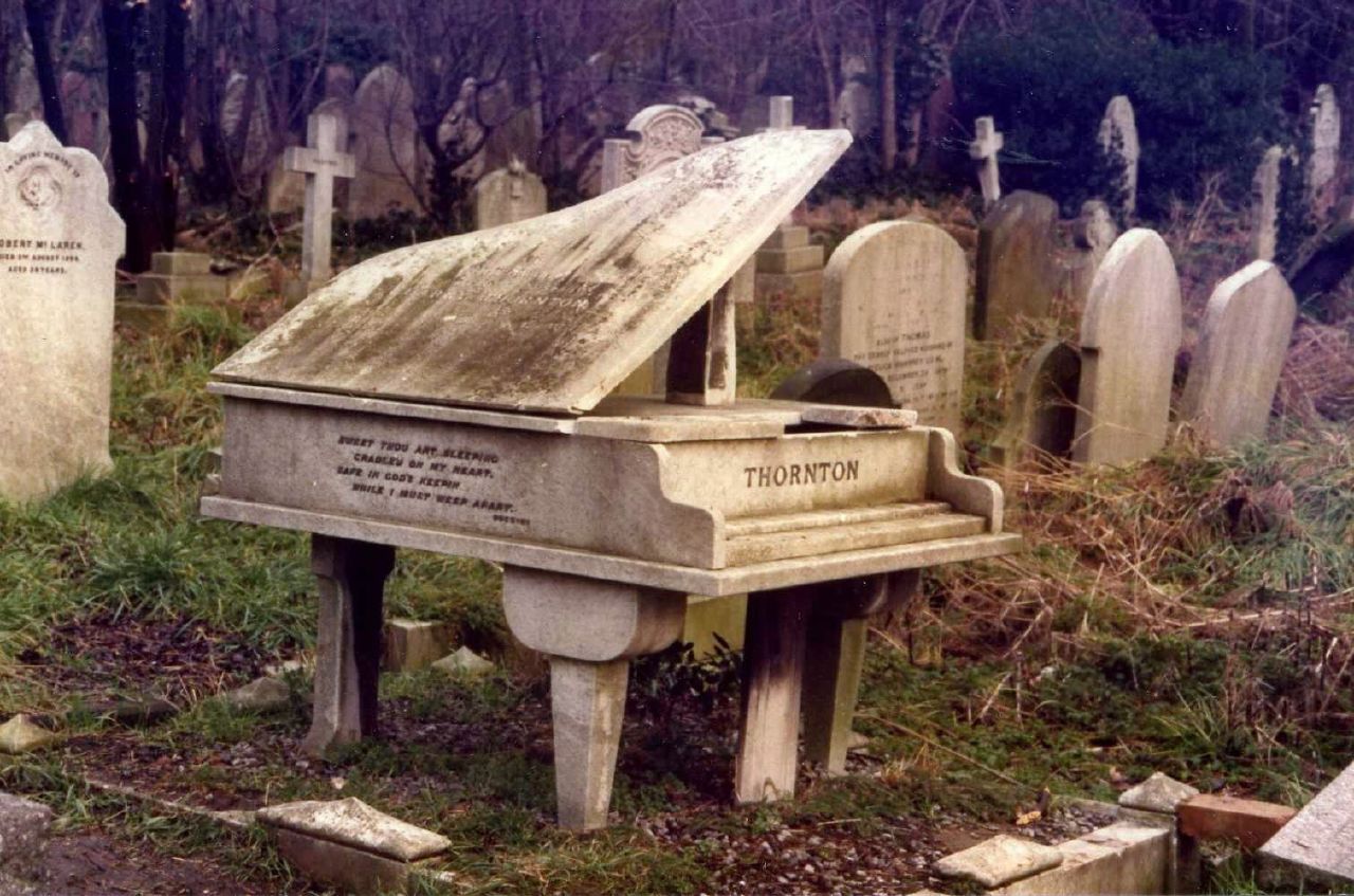
The practicalities of shooting there are slightly more difficult. The cemetery is open for the majority of the day and is free for under 18s, which most of us are. However there may be a lot of people around and there may be security guards who might stop us filming. To counter the first of these we've found an inset day in the middle of the week, and as this is only a holiday for our particular school there shouldn't be too many people around - who goes to a famous cemetery in the middle of the week? I'm not sure what security will be like, but I'm sure we'll be able to get around it and that we'll at least be able to film something. The only other problem is that we won't be able to do so much planning in advance as we did with Trafalgar Square last year, as there aren't pictures that would show us the whole location and where all the interesting parts are.
The practicalities of shooting there are slightly more difficult. The cemetery is open for the majority of the day and is free for under 18s, which most of us are. However there may be a lot of people around and there may be security guards who might stop us filming. To counter the first of these we've found an inset day in the middle of the week, and as this is only a holiday for our particular school there shouldn't be too many people around - who goes to a famous cemetery in the middle of the week? I'm not sure what security will be like, but I'm sure we'll be able to get around it and that we'll at least be able to film something. The only other problem is that we won't be able to do so much planning in advance as we did with Trafalgar Square last year, as there aren't pictures that would show us the whole location and where all the interesting parts are.
Moodboard #2 - Surrey Hills
The second picture on the moodboard is of Surrey Hills, and more specifically - Box Hill. Box Hill has been the location for a number of high budget films, most recently The World's End, however in this film it only featured for a few minutes. We could use Box Hill for a number of outside country shots. What makes professional trailers look professional is that they have a wide variety of locations and costumes from a wide variety of scenes, so by having the contrast of somewhere like Box Hill with Brighton Pier there is a sharp contrast between the green nature and the coastal nature, and Brighton city and a view over Surrey. There are also stepping stones across a river, which is an interesting location, but they wouldn't be quite suitable for our film, as our film is a serious action movie. They may work well in a montage sequence for a romance movie, but I don't think they'd be quite right for us.
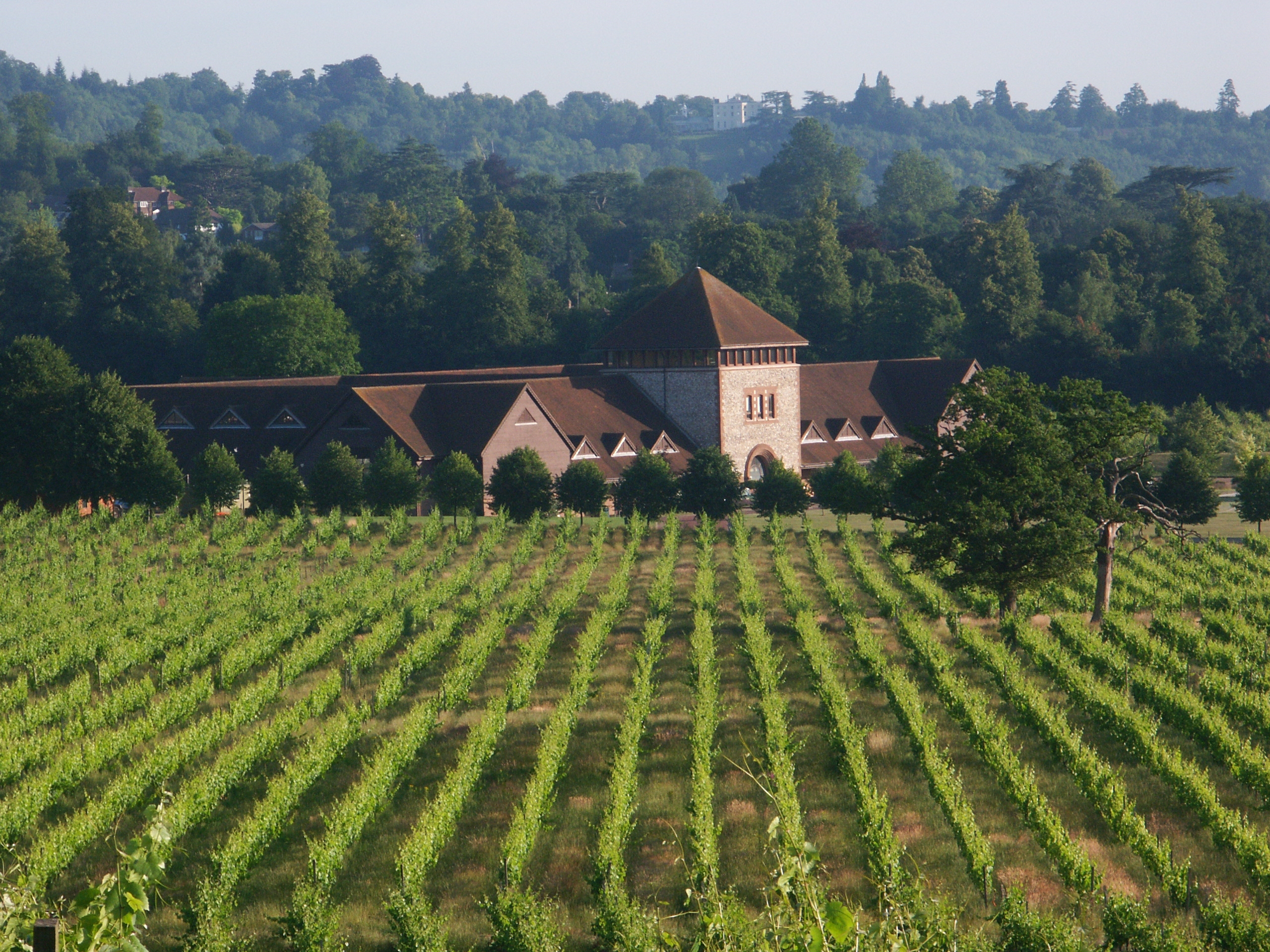
Not far from Box hill is Denbies wine estate and vineyard. Denbies has quite a foreign look to it, and can also look quite daunting, seeming as its look is not dissimilar to Auschwitz. We were considering using it as the location for the antagonists' mansion because of this foreboding look. You can also get inside it as there is a restaurant, so we would be able to get inside it and have some shots of the antagonist walking inside. The vineyard surrounding the estate is also a good location for a chase sequence, and would also make a very strong location.
Not far from Box hill is Denbies wine estate and vineyard. Denbies has quite a foreign look to it, and can also look quite daunting, seeming as its look is not dissimilar to Auschwitz. We were considering using it as the location for the antagonists' mansion because of this foreboding look. You can also get inside it as there is a restaurant, so we would be able to get inside it and have some shots of the antagonist walking inside. The vineyard surrounding the estate is also a good location for a chase sequence, and would also make a very strong location.
Moodboard #1 - Brighton
A potential location that we have chosen for our film is Brighton, and more specifically, Brighton Pier. Brighton Pier is a very iconic location that isn't too far from where we live. Also it would be good as we currently don't have any coastal locations, and they look very high budget. The Pier would be an exciting place to have a chasse sequence - along the length of the pier. This wouldn't take too much time to film, but it would be tricky to film it effectively. Underneath the pier is also a good location, as there are lots of metal poles that could be used as obstacles. As it is by the sea we could take the fight into the sea and have a fight amongst the waves. We would have to be very careful with this though, as we don't want people to think that we're actually fighting and we don't want to get the camera wet.

Around Brighton there are a number of other locations that we could film at. There is the Brighton Pavilion, which is a Georgian palace with public access to the grounds. We'd be able to film a few shots in front of this just to fill space in the trailer and to make it look higher budget. These are likely to be just shots of a character standing with his back to the camera, looking towards the Pavilion. There is also the burnt down old Brighton Pier, which would look spectacular at sunset. We could get some really iconic looking, pituresque shots there. Brighton would be an exciting location, and would work as a good contrast to the urban city settings.
Around Brighton there are a number of other locations that we could film at. There is the Brighton Pavilion, which is a Georgian palace with public access to the grounds. We'd be able to film a few shots in front of this just to fill space in the trailer and to make it look higher budget. These are likely to be just shots of a character standing with his back to the camera, looking towards the Pavilion. There is also the burnt down old Brighton Pier, which would look spectacular at sunset. We could get some really iconic looking, pituresque shots there. Brighton would be an exciting location, and would work as a good contrast to the urban city settings.


Thursday, 26 September 2013
Poster Analysis - The Social Network

The The Social Network poster is different to any that I've analysed before, and this may be due to the fact that this is advertising a drama, whereas most of the others have been advertising action films. It is probably much easier to make posters for action films as they have thousands of frames that look exciting and action packed. To create a successful action film poster the key seems to be to find a shot of the protagonist holding a gun in a cool way and add some sort of landscape background. Dramas, however, do not have it as easily as they do not tend to have explosive moments that make it look exciting. In some dramas most of the film is talking - how do you make an exciting film poster of people talking? Many dramas go down the route of having the main characters pulling some sort of pose, and then their all put together in one poster. This technique is not greatly effective however, as it makes it look less 'high brow', and arty. Part of the appeal of dramas is that they're intelligent, and a poster that just jumbles together characters is not very effective at all. People expect more from dramas - they expect them to have some sort of clever design to match the clever nature of the film. One such example of a clever poster to match a clever film is the Tinker Tailor Soldier Spy poster that I analysed earlier on this blog. This The Social Network Poster also demonstrates how drama films are able to devise clever and relevant posters.
The design of this poster is obviously done to match the storyline of the poster - the creation of Facebook. Along the side of the poster is the toolbar used on the Facebook website. This is iconic in its own way, as over 500 million people use Facebook, so over 500 million people would recognise this. There is something written in the search bar, but unfortunately I cannot read it, but I presume it is something meaningful that would help the advertisement of the film. The name of the film is put where the Facebook logo is put on the website, and it is written in the Facebook font, so this obviously lets people know that the film is about Facebook. It never explicitly says that the film is about Facebook, as that would detract from the intelligence of the poster, but it does obviously imply it through the toolbar at the side and the Facebook font. Anyway, with a film called The Social Network there are only a limited number of probable guesses that the viewer could make as to which website the film is about, and for most people Facebook would be the first social network they think of anyway. By making a film about such a big and well used website gives the company a ready made fanbase. There are over 500 million people who use the site, so that's a huge audience that the film could market towards. It's not even just restricted to this audience, as there are the people who haven't got Facebook but are still interested in the film. I actually went to see the film with someone who wasn't on Facebook at the time. As time goes on and more people join Facebook the fanbase for this film is destined to grow bigger and bigger, and even if it doesn't gain much at the cinema, it could still gain a large profit from DVD sales.
The main part of this poster is the central part, rather than the fake toolbar at the side. The character's face fills the whole of the central part of the poster and this is similar to the positioning of a profile picture, another key feature of Facebook. This furthers the Facebook theme of the poster, and again makes it obvious what the film's about. His expression seems worried, almost scared, and this creates an enigma, which draws in the viewers. They want to know why he is worried, and more importantly they wonder why he is worried about such a innocent website like Facebook. Facebook users may see the poster and think that the film is about the negative effects of Facebook and go and see it out of worry. This, however, is a long shot. More important than the enigmas is the actor. Jesse Eisenberg is a very well established actor who has been in a number of big films. Every actor has his fan base and I'm sure that Jesse Eisenberg isn't any different. Any big name actor that is in a film brings with them a ready made fanbase who will go to see a film purely because it has that actor in it. One of the key parts to this poster is the tagline that covers his whole face - 'You don't get to 500 million friends without making a few enemies'. This creates more enigmas, and it is clear that there is something dark behind the innocent Facebook facade. It makes people wonder what the film is exactly about and who the person is who has made that many friends. For many people they will go and search it on the internet, and this is another step closer to bringing them into seeing the film. Dramas sell because of their storyline and once it has got people to look up the storyline, then that is all the selling done.
In conclusion I think that this is a very strong poster, as it sells a tricky genre to a wide audience. Facebook appeals to many demographics, of most ages and both genders. This poster takes advantage of that. It also manages to sell the film with it's storyline. Having the tagline covering the whole poster makes it stand out and makes the audience want to know more about the storyline. There are already a few enigmas set up, and the general design of the poster is very interesting.
Magazine Front Cover Analysis - 'The Cool Issue'

Sometimes film magazines are not focused on one particular film, but have a few different films - and this is an example of that. It is called 'The Cool Issue', which is a bit of a weird name, as no one wants to read a magazine called the cool issue; it makes it sound childish and aimed at a much younger audience. Actually, looking at the front cover all of the taglines sound ridiculous and childish, with plays on alliteration, such as 'Robocop Rules', 'Katniss Kicks Ass' and 'Harry gets Horny'. Every one of those taglines makes you want to cry. They are incredibly cringey, and would make most people reach for the Empire magazine on the shelf instead. That being said, the middle one (Harry gets horny) would attract some viewers wondering what film he is in where he has to wear horns. Admittedly I had to look inside out of interest. As much as I can say that it's a cringey magazine front cover, it did do the job for me, as it did make me want to open it and see what the cover was talking about. However, I don't think it was the tagline that made me look inside the magazine, it was probably more the odd picture of Daniel Radcliffe with horns. For other people it may be that it's advertising the second Hunger Games film or for others the Robocop film. Both of these films are likely to be hugely successful, as they already have a very large fanbase and this fanbase would want to read as much information about the films as possible. This works for Daniel Radcliffe as well, as he has a very large fanbase from the Harry Potter films and many people want to know what he will do next. Even people who aren't Harry Potter fans may be interested to see if he can ever break out of the role of Harry Potter and be acknowledged as an actor in his own right. In a way, this magazine front cover is working more as a gossip magazine than a film magazine, but this isn't necessarily a bad thing, as gossip attracts a wide audience. It does slightly isolate a male audience however, as they do not so much want to be associated with reading gossip, and the front cover doesn't have a very manly design. This is an odd advertising choice, as most of the other editions of the magazine seem to be marketed towards a specifically male audience, so the sudden change in advertising distances the fanbase that they've already build up. The light blue colour scheme doesn't help to bring the male fanbase back, as it's not a very manly colour. If the magazine was planning on widening their demographic scope, then they should have at least left something for the men that they were originally targeting. A darker background could have rectified this, with the taglines appealing to a wider audience, but the background keeping the original audience. The danger of completely aiming at a new audience, is that the new audience may not pick up on it due to their previous thoughts of Total Film and the old audience stops reading it because it doesn't appeal to them any more, leaving them with a much reduced audience.
Again this magazine front cover has a sort of 3D design, with the characters coming out of their boxes. The main three characters on the front cover have the tops of their heads sticking out of the top border of the boxes, which makes them come to life a lot more. By having them almost jump out of their boxes the pictures spring off the page, and seem to be reaching out towards the viewer. This establishes a relationship between the front cover and the viewer and through this connection the viewer may feel that they want to buy the magazine. This seems to be a common technique in magazine front covers, with the characters going beyond the boundaries of the front cover. Perhaps this is something that we should be thinking about in relation to our magazine front cover, as it is an effective technique, it looks professional and it makes the front cover look much more exciting. It won't be the easiest technique to work out, but I think that we should be able to manage it after a few tests. Also on the design front, I like the slanting banner at the bottom which makes the front cover look more exciting and less formal. As it is a film magazine it is supposed to look exciting as it is something that people follow in their free time, rather than something that is essential for work. The slanting bottom banner has this effect, as it is making the design of the front cover more free and unconventional. The banner is split into several stills from films, and this gives it the effect of looking like a roll of film, which is obviously something that is relevant to a film magazine. This doesn't have any particular effect to pull in the viewer, but is just aethetically pleasing, which in itself would help to attract a viewer. Underneath the banner are some bullet points of other films and articles that are in the magazine. It is not necessarily the content of these bullet points, but more the sheer number of them that helps to make the magazine appealing. It makes the magazine look as if it is full to the brim with exciting articles, and that there must be something for everyone. This 'something for everyone' hypothesis may have been what prompted the publishers to have the three films instead of just one film on the front cover. It is probable that the majority of people who see the magazine would find at least one of the films appealing, increasing the magazine's chances of being sold. The front cover as a whole is very busy and it looks like there is a lot going on on it, which I suppose there is. It is divided up into many sections, any of which could pull in a potential buyer. Although this style may be effective in selling the magazine, I don't think that it is the best looking magazine front cover design. I find that there is too much to look at, and I'd rather see one big picture from a film, rather than lots of smaller pictures. I think it looks slicker and more professional with just one cover feature, but that may just be me. It almost seems as if the publishers had too many good ideas at once and decided to put them all in the same front cover, but they don't necessarily complement each other, and the front cover ends up just being a mess of contrasting ideas. Even so, it is interesting to see an alternative way of presenting a film magazine front cover.
In conclusion I don't think that this is a very effective front cover, as it alienates the male viewers who the magazine has previously been appealing to. The cheesy taglines just make it seem childish and ridiculous, whilst the baby blue colour scheme supports this effect. Apart from these massive errors the magazine front cover does have some positive design attributes, particularly with the characters' heads lifting out the top of their boxes. The film roll style banner at the bottom helps to show that it is a film magazine, but also just make the front cover look more exciting. On the other hand I feel that there is too much going on, and I think I prefer the covers that just have one film. Overall a bad front cover, but there are still some positive parts to take from it.
Thursday, 19 September 2013
Magazine Front Cover Analysis - Terminator Salvation

The magazine front cover for Terminator Salvation is another front cover that proves that action films work very well on magazine front covers. What helps make this front cover so successful is the layering of the photos to make it look more 3D. In the foreground is the head of a Terminator machine, then the next layer has Christian Bale and Sam Worthington, and then the background is made up of a blurry terminator on one side and a building on the other. Holding all these layers together are the sparks which occur in all three of the layers. Also helping to glue the cover together is the blurry effect that is used on most of the background and around the various layers. It would look very fake if all the photos were simply put one on top of the other, as they would look obviously layered. However here the blur tool is used to cover the cuts between the layers and blur them together. There is a tool on Photoshop which allows you to do this, as it take the colouring of both the layers and creates a sort of blur that links the sections together. There is a very obvious stylistic blur surrounding Christian Bale and Sam Worthington, but this is done to also give the effect of a post-apocalyptic atmosphere and a wasteland. The blur effect glues the photos together and creates atmosphere, neatly killing two birds with one stone. Towards the top of the picture seems to be dust clouds. These also add to the effect of the post-apocalyptic atmosphere, and having this just confirms that the blur isn't meant to be a blur, but in fact is meant to be part of the atmosphere. Having it at the top of the magazine also makes them look as if they are dark clouds overshadowing the scene, making it look more foreboding and dangerous. This is called pathetic fallacy - using the weather to create a certain mood. But in this instance it isn't strictly speaking the weather, which is a very interesting technique.
As seen in almost every magazine front cover, the characters on the poster are looking directly at the viewer, and one of them is aiming a weapon at them. This is obviously a tried and tested way of making magazine front covers and I agree that it is a very powerful technique. Perhaps this is a technique that we should start thinking about using in our poster, as it would make it look more professional and would appeal conventionally to the viewer. On the other hand, the poster could stand out by going against this convention. For example, if the character on the poster had their back to the viewer it could effect them in an equally, if not more powerful way. On the shelf in a shop, there would be hundreds of magazines with people looking at the viewer and trying to connect with them, as seen in numerous of these magazine front covers. Therefore the viewer would not so much be drawn in by the people looking at them, but by the people who aren't looking at them. Their eyes would be drawn to what is unique and stands out, and perhaps a figure facing away from the camera would do this very well. By analysing these front covers I can see both what is conventional and works, and what could be unconventional and original. This is perhaps something that I can experiment with when making our magazine front cover, as it could be a very good technique. On the other hand it may not work at all, as the audience would feel as if they aren't connecting with the character and they don't want to make the effort as the character isn't. This is an issue which I would have to address before making a final decision on it.
When making my front cover I won't just be looking at how to position the actors in the picture or what fonts to use, but I'll also have to work on the smaller things, such as where to position the bar code, price, issue number etc. The bar code here is hidden away in a corner that is not used so much in the big picture - there is a corner specially darkened to fit the bar code into. This is something we may want to think about before completing editing on the picture, as we don't want a bar code covering up an important part of the picture. But to be honest, I don't see why these magazines don't just put the bar code on the back of the magazine; it would look far better not taking away from the drama of the cover photo. The price and issue number are both inside the dip of the 'M' of 'FILM', which I thin it s a very clever place to put them. In most magazines it is conventional to put the price and issue number next to the title, but this is a far more interesting design as it interacts with the title. This makes it almost melt in with the rest of the cover, and it isn't so obtrusive. Unless there is some sort of bargain the magazine doesn't want to immediately be showing the viewer the price.
Overall I think that this is one of the most powerful magazine front covers that I have seen. The images are very strong and the layering makes it seem genuinely real, rather than just a photo. It makes it more of an active front cover, as if it's a frame taken straight from the film. Through analysing this I have also learnt a few key points as to where to position the various parts that are essential on a magazine front cover, such as bar codes, prices and issue numbers. These have to go on every magazine, so I'll have to be putting it in at some point. Also I have found that maybe it's not best to go with a fully conventional front cover, but do something different so it stands out, rather than just sinks in with all the other magazines on the shelf.
Magazine Front Cover Analysis - Inception

This issue of Total Film has a particularly interesting 'Inception' front cover, mainly because of the interesting backdrop behind the protagonist. The background is particularly interesting due to the juxtaposition between the active, exciting backdrop and the calm, still protagonist. Although some people would consider the stillness of the protagonist to be a negative attribute as it doesn't show off the action of the film, I think that in this case it is a very strong choice because the juxtaposition makes the character look a lot more suave. It makes the character look more at home in his surrounding and this creates an enigma as to in what world the film is based and who the character is. Of course part of the appeal of the character is that he is Leonardo DiCaprio, one of the most famous actors of the modern age, who is notorious for making good films. DiCaprio has been very careful with his film choice, and it is now well known that films with DiCaprio in are likely to be good films, not just because he's a good actor, but because he picks good films. In the marketing of 'Inception' the film could have easily run the risk of seeming like an unintelligent, manufactured Hollywood blockbuster with a lack of plot and an overdose of action. However just by having DiCaprio in the film all of these worries are put away, as he is never seen in films like those. In a way DiCaprio acts as the audience's good film guarentee. The director of the film - Christopher Nolan - could equally have sold the film with his name, as he is well known for making very good action films such as the 'Dark Knight Trilogy'. He has also proved himself as an intelligent filmmaker through 'Memento' and 'The Prestige'. Although these earlier films have for the most part been forgotten, they still serve as good advertisement to the select few who have seen them. It is mostly through the 'Dark Knight Trilogy' that Nolan has met significant fame and acclaim as they were widely watched and positively reviewed. This leads me to wonder why the front cover doesn't advertise the film with Nolan's name - his name isn't even mentioned on the poster. This is especially odd, as the readers of Total Film are exactly the sort of people who would ahve heard of his earlier works such as 'Memento', and the name 'Christopher Nolan' would sell even better in a film buff community. I think that this is one of the big problems of this poster; they seem to have missed a very powerful advertising asset.
Much of the font on the front cover is red to stand out from the rest of the font. On the right hand side there is a red plus sign, which is one of the conventions of the Total Film magazine to show the readers all the extras that the reader gets inside the issue. Just by having extras the magazine has a selling point, as it shows it is more than just an average magazine, but has more to offer. By making this sign red the magazine cover draws the attention of the viewer to the fact that there are extras to be had inside the magazine. This is what the red font does across the front cover - it almost takes the viewer on a tour of the front cover, dragging their eyes from one place to another to make sure that the viewer sees all the aspects the magazine has to offer. On the left hand side of the magazine, in this red font is written 'First Looks!', which makes the magazine look more prestigious as it is getting the first insight into all of the film business. In a way it is almost claiming to be the first to have the 'first looks', but in reality it simly means that first looks have been released and this issue of 'Total Film' investigates them. This is a very clever way of advertising - through telling half-truths - it doesn't ever tell a lie, but it exaggerates the truth and words it in different ways. At the top of the magazine is the line 'The Mind-Blowing Issue' and underneath the picture the words 'Mind-Blowing' are repeated again, and both times the font is in red. The magazine seems very keen to advertise the 'mind-blowing' aspect of the issue, and to show that this is a key part of what Inception is like. In the whole 'Inception' advertising campaign, the film was marketed as being a mind twister. Although in reality the film wasn't as complicated as it was made out to be, the advertising campaign still made many people come out of the cinemas saying that they found it confusing because they'd got it into their heads that it was. This then boosted all the reviews of the film, and heightened the prestige of Christopher Nolan as a clever director. All that comes back to the simple advertising as seen on this magazine front cover. The last piece of red font on this front cover is advertising the film 'Tron', and this is probably to show that the whole issue isn't solely about 'Inception', but there is a lot more to it. Even if people don't like 'Inception', they may still buy the magazine because it has information about 'Tron'.
In conclusion this is a very powerful magazine front cover, but then this can be expected as the film is relatively easy to sell simply through using Leonardo Dicaprio. The red font also sells the magazine well, as it draws the viewers' attention to parts of the magazine that the viewer may not have noticed before, but are all very good reasons why they should buy the magazine. In this analysis I haven't even got onto analysing the title of the magazine, which has been edited to look metallic and science-fiction-esque. The background to the protagonist is exciting and the juxtaposition between the actor and his backdrop make the front cover stand out.
Tuesday, 17 September 2013
Audience Profiling - Argo & Anna Karenina
The 2012 film 'Argo' appeals to a very different audience from Avatar. The target audience is probably older, of a higher social class and it does not appeal as much to a universal audience, due to its negative depiction of Iranians. The target audience is probably older as the film takes place in the 70s against the backdrop of the Iranian Revolution, so this would appeal to an older audience who lived through the time and can relate it to their own experience of the event. It also probably has an older target audience as it doesn't have any action sequences (unless the ending counts as an action sequence), but instead relies on the drama to carry the film. Dramas are stereotypically enjoyed more by older audiences. However, that being said, Argo also has a wider appeal as it won the Oscar for Best Picture in 2013, and so it's audience rapidly expanded to any age 16+ who watch critically acclaimed films. When a film is given Best Picture many people watch it as they want to pass their judgement on it and see if it really is as good as was made out. An audience which it doesn't appeal to is the Middle Eastern audience, due to it's negative depiction of Arabs, in particular, Iranians. There was a huge outcry in Iran about the film, and they have begun work on their own film depicting the events of Argo in a different light, with the Iranians as the protagonists. This shows how the film targeted this audience very badly, but then it would be hard to create a version of the events that portrays both the Americans and Iranians in a good light.
'Anna Karenina' is an interesting film to study the audience profiling for, as it has three distinct features that dictate the audience. It's based on a classic novel, it's a period drama, and it's filmed in an arty, abstract way. The fact that it's a classic novel makes it appeal to a stereotypically older audience, who enjoy reading, and in particular enjoy reading old books. Anna Karenina to a modern audience reminiscences over Imperial Russia with all its glamour and balls, as opposed to the Stalinist legacy that Russia leaves now. Through this the film appeals to an older audience as they are stereotypically tired of misery and warfare in life and want to relax in their old age, so Anna Karenina takes them back to a time before the troubles of the 20th Century. The abstract nature of the film appeals to a lot of film buffs who are interested to see new styles of making films and new ways of telling stories. It could have been a ground-breaking film in the progression of abstract cinema, and although it wasn't and is now mostly forgotten, at the time it would have had a very interesting style. The film also manages to appeal to a younger audience through the casting of the actors Jude Law and Keira Knightley. Keira Knightley has been in many period dramas that have had an appeal to a younger audience, such as 'Atonement' and 'Pirates of the Carribean'. Jude Law is famously good-looking and appeals to a young, female audience, of which he has a large fan club. He also has experience in period films, such as 'Sherlock Holmes' and 'Enemy at the Gates'. The prospect of having both of these actors in the same film would be very exciting for a young audience, and they may go to see it purely for this reason. It would also attract groups of Literature students from school, as it is based on a Classic novel.
'Anna Karenina' is an interesting film to study the audience profiling for, as it has three distinct features that dictate the audience. It's based on a classic novel, it's a period drama, and it's filmed in an arty, abstract way. The fact that it's a classic novel makes it appeal to a stereotypically older audience, who enjoy reading, and in particular enjoy reading old books. Anna Karenina to a modern audience reminiscences over Imperial Russia with all its glamour and balls, as opposed to the Stalinist legacy that Russia leaves now. Through this the film appeals to an older audience as they are stereotypically tired of misery and warfare in life and want to relax in their old age, so Anna Karenina takes them back to a time before the troubles of the 20th Century. The abstract nature of the film appeals to a lot of film buffs who are interested to see new styles of making films and new ways of telling stories. It could have been a ground-breaking film in the progression of abstract cinema, and although it wasn't and is now mostly forgotten, at the time it would have had a very interesting style. The film also manages to appeal to a younger audience through the casting of the actors Jude Law and Keira Knightley. Keira Knightley has been in many period dramas that have had an appeal to a younger audience, such as 'Atonement' and 'Pirates of the Carribean'. Jude Law is famously good-looking and appeals to a young, female audience, of which he has a large fan club. He also has experience in period films, such as 'Sherlock Holmes' and 'Enemy at the Gates'. The prospect of having both of these actors in the same film would be very exciting for a young audience, and they may go to see it purely for this reason. It would also attract groups of Literature students from school, as it is based on a Classic novel.
Audience Profiling - Avatar
Audience profiling works on stereotypes. This is the only way that it can work - making generalisations about certain social groups in order to make quick and easy assumptions about what sort of audience the film would appeal to. This does not mean that all the stereotypes are right, as virtually anyone is an anomaly in their own way, making audience profiling much harder. Audiences tend to be split into groups by age, gender, class, nationality and sometimes, though rarely, race. Stereotypically a Western male, aged 16-25 of working to middle class background enjoys fast-paced action movies. Just changing one of those factors, would change the genre completely, for example, a Western female, aged 16-25 of working to middle class background would stereotypically enjoy chick-flicks. On the other hand, a Western female, aged 65+, of middle class background would stereotypically enjoy period dramas. Many factors come into play when working with audience profiling, and a film that fails to get the right audience would be a flop.
'Avatar' is fortunate in that it targets just about anyone in the 16-25 demographic. Its fast-paced action sequences, battle set pieces and outer-space setting appeals to the male working class to middle class audience. Also appealing to this audience is the advances in CGI technology that it displays. Many people in this audience stereotypically assume that good CGI is what makes a film good, rather than the acting, storyline or anything else. This audience is primarily concerned with visual spectacle, which Avatar delivers. It also appeals to a 16-25 female audience, through the 'Dances with Wolves' style romance that it delivers. In the advertising campaign it didn't really weigh very heavily on this aspect, however, perhaps as it was trying to attract the male audience more. With feminism becoming more and more fashionable amongst young women in recent years, the strong female characters in the film give it extra appeal. In addition to all of this, the film was nominated for several Oscars including Best Picture. In the run up to the Oscar's there was a lot of competition between Avatar and The Hurt Locker as to who was going to win Best Picture, and although Avatar didn't win in the end, it was still seen as a very critically acclaimed film. This attracts the Upper Class audience and many people above the age of 25.
'Avatar' is fortunate in that it targets just about anyone in the 16-25 demographic. Its fast-paced action sequences, battle set pieces and outer-space setting appeals to the male working class to middle class audience. Also appealing to this audience is the advances in CGI technology that it displays. Many people in this audience stereotypically assume that good CGI is what makes a film good, rather than the acting, storyline or anything else. This audience is primarily concerned with visual spectacle, which Avatar delivers. It also appeals to a 16-25 female audience, through the 'Dances with Wolves' style romance that it delivers. In the advertising campaign it didn't really weigh very heavily on this aspect, however, perhaps as it was trying to attract the male audience more. With feminism becoming more and more fashionable amongst young women in recent years, the strong female characters in the film give it extra appeal. In addition to all of this, the film was nominated for several Oscars including Best Picture. In the run up to the Oscar's there was a lot of competition between Avatar and The Hurt Locker as to who was going to win Best Picture, and although Avatar didn't win in the end, it was still seen as a very critically acclaimed film. This attracts the Upper Class audience and many people above the age of 25.
Wednesday, 4 September 2013
A Low Budget Thriller
Thrillers are notoriously a very high budget genre, and with this in mind, for the thriller to be successful, it needs to look expensive. Obviously, we do not have the money to make a high budget, explosive thriller, so we must figure out ways to make it look much more high budget than it actually is. To do this we must avoid trying to include things that involve destruction and explosives, and focus on good film making, in order to not look like we're trying and failing, but instead look as if we know what we're doing. Therefore we must very carefully plan out a suitable story, that could be filmed on a low budget, but could look as if it was filmed on a much higher one. In the world of successful thrillers it's all about production value.
An easy way to boost this production value is location. No one wants to see a film that is filmed in the director's back garden or bedroom, and they don't want to see a film that was filmed in the directors school either. Of course, schools are used a lot as locations, but they are very idealistic schools, and most schools just don't look 'cinematic' enough. Our school especially does not look even the tiniest bit cinematic. Even if houses and schools are avoided, it would still look cheap to film down the local high street, as, once again most of them do not look 'cinematic' enough, and once again, it's a very cheap look. If you were to take a look at the latest Bond film 'Skyfall', you'd realise that most of the locations were very exotic, and there's not a single scene in the film that is filmed somewhere less than spectacular. This is a convention of most thrillers, that must be followed. Location scouting, therefore, becomes a key part of making the film, and is something that I'm going to focus on very keenly. So if I've crossed off all the obvious, amateur-cliche, 'uncinematic' places, then that means that I'm goign to have to go further afield in order to make this film well. My mind is drawn straight to London, which is a mere 45 minutes away on the train. London has many extremely iconic locations, and just one of them would boost the production value considerably. I shall definitely put it under consideration! The only problem is that most thrillers require weaponry, and I'm not planning on pulling out fake guns in the middle of London, so if we were to film in London, then I'll have to adapt the opening scene to suit it. I shall discuss locations further in a later post.
Another way to boost the production value is the acting. The fact is, picking actors out of friends is never going to be the same as having Hollywood actors, so the acting needs to be both easy and minimal. If they're not good actors, then the obvious option is to give them an easy part, and a small part. Give the bigger parts to the better actors, and adapt the parts to suit them. To get around this acting dilemma, I'm also going to make sure that there isn't much acting needed, just following people, or getting punched, or waiting...simple things like that. I'm not planning to give them roles that the greatest actors would struggle to play!
Yet another way to boost the value is to play on my strengths. I know what I can and can't do, and I know what I can and can't afford. For example, if I had a car that was going to the dump anyway, I'd have a scene which involves a car being destroyed, which would look incredibly high budget, but it would actually cost me nothing! I'll have to think over what these strengths are. I also already own a lot of film making equipment, so I can use this to my strength. I am very adept with using Final Cut Studio, so I will edit my film on that instead of the school's option of Adobe Premiere. Personally I prefer Final Cut as well...I shall discuss it in a later post.
I've found three solid ways to boost my production value, and I am sure to think of more! This is a very good start, because if it looks as if it's expensive, it'll look much better. I don't want my audience knowing that it was done by an amateur, and I don't want them thinking about what's wrong with it, such as a shaky camera, bad match-on-action, or some stupid cheap errors. I want them to be thinking about it in the way they would think about any film: about the storyline, and what's good. With many amateur films I find myself thinking about what's bad about it, but I want my audience to be thinking what's good!
Tuesday, 3 September 2013
Trailer Analysis - Quantum of Solace
Despite not being the most critically acclaimed of Bond films, the trailer for 'Quantum of Solace' is still very powerful and does a good job of selling the film. Although it was criticised for having too much action and very little plot, this works in the film's advantage in regards to the trailer, as there is plenty of variety when it comes to showing action sequences. As with the 'Clash of the Titans' trailer it makes it look as if the film is non-stop action (which, to be fair, it is) and looks exciting from start to end. I particularly like the start of the trailer, which juxtaposes fast flashes of shots with slow fades in. This is most obvious in the sequence between 0:39 and 1:03 where it goes from such fast shots that it is hard to even tell what they are, and Bond walking up a hill in slow motion. Behind all of this is the James Bond soundtrack, which hits an iconic five notes in time with the quick shots. The James Bond theme is so iconic, that if people didn't realise they were watching the James Bond trailer before, they would do at that point. The slow shots are accompanied by a long, drawn out note and a line from 'M' which creates an interesting juxtaposition. This builds the tension, as in the slow motion shots Bond slowly lifts up his gun, whilst the fast shots show sneak previews of the action sequences to come, without giving too much away. It holds the audience in their seats as they look forward to what is going to come next. As the sequence moves on, the long, drawn out note grows louder each time it returns, building the tension very powerfully. Also building the tension is the slow realisation that in the slow motion shots Bond is carrying a gun. In the first of these shots just Bond's head is seen, so the audience is made aware that it is Bond, but are also aware of the tense note in the background, leading them to the conclusion that there is more to the shot. Then in the second of these shots it reveals that Bond is holding something in his hand, and then in the third shot it is clear that he is holding some sort of machine gun and he raises it up, as if readying it for action. The audience now realise that something important is going to happen and avidly await the climax of the trailer. By having a satisfying climax (which I will discuss next), the film gives the audience what they want and they go away from it wanting to see the whole film.
The climax of the trailer is very well put together, especially from when Bond asks 'How long have I got?', to which the response is '30 seconds'. From then until the end of the trailer it is exactly thirty seconds, which almost makes it seem as if the characters are aware that they are in a trailer. This establishes the all important relationship with the audience, and they feel like the film makers have had them in mind whilst making the trailer. It seems to be done to impress the audience, and this is appreciated as they know that the trailer is meant to sell the film to them, not to just be a Directors' showreel. The last thirty seconds of the trailer are extremely fast, trying to fit in as much action as possible in as little time as possible. It is specifically marketed towards the stereotypical male demographic, showing nice cars, action sequences and sex scenes. There is also a nod to the female audience through the shot of Daniel Craig topless. This is one of my favourite trailer endings, as it gives itself the challenge of fitting as much as it can in thirty seconds, and pulls it off exceptionally. The James Bond music in the background helps it even more, with the action seeming even more intense as a result of it. The amount of variety in these last moments is astonishing, with chase sequences in planes, cars, boats and on foot. It is very impressive how much has been fitted in. For our trailer I'd love to create something like this, maybe giving ourselves a similar challenge to fit as much as possible into a very short time frame. I also like the way that the trailer starts very slowly and manages to pick up a very fast pace by the end. The opening shot sets the scene very well: dragging the chair slowly across the floor in a darkened room. The sound effect of the chair scraping the floor is drawn out to the perfect extent to make it sound highly menacing. The following few shots assist this menacing start with the darkened lighting that only shows half of peoples faces, leaving the rest of their face covered in shadow. This follows the dialogue, where the antagonist says 'we have people everywhere', making it seem like no one can be trusted which makes the audience wonder who to trust, with everyone in the shadows.
This trailer is very powerful and I have learnt a lot through analysing it. I particularly like the ending where the film makers set themselves the challenge of showing as much of the film as possible in thirty seconds. This is something that I could take inspiration from, as it is a good technique of engaging the audience and establishing a relationship. It is also very memorable, as it is an original way to kick start the climax of the trailer. There is a lot to like here, from the juxtaposition of fast and slow editing to the drawn out opening shot of the chair being dragged along the floor. The lighting is very gloomy at the start and begins the trailer with a foreboding atmosphere. This is sure to become a trailer that I will reference back to many times over the course of creating my trailer.
Film Ideas
Rom-Com

Dino-Drama

Thriller

The third idea we are not so keen on, as we think that it would be too hard to do. The basic idea is that we make a fairly standard cliche thriller movie. The film would be a sort of sequel to the film we that we did last year, with Agent Davidson returning for another adventure - this time with a team behind him, and another retired agent. Maybe we could have a sort of resurfacing of a criminal organisation that he must put down, or something along those lines. This is our least favourite of the ideas as it lacks drama and a unique selling point.
Poster Analysis - The Hobbit: An Unexpected Journey

This poster is one of four limited edition posters released around the time of the release of the film 'The Hobbit: An Unexpected Journey' and was specifically tailored for fans to collect. They were only given out at IMAX showings on the first day of release, so are more of an incentive to buy the IMAX tickets for the first day in order to get the film a strong opening weekend. It comes in a pack of four, with the other three showing Thorin, Gollum and Gandalf instead of Bilbo, and all of which I have my own copy of, so I am aware of their power as posters. Having a selection of characters on different posters is a technique that is very common in marketing a film. Whenever a film with a large cast is released there is always a flood of 'character' posters, and these sell much better then the standard posters as they sell several times, with fans buying a few posters with different characters, rather than just one poster with them all on. Many people find these sort of posters hugely appealing, as they seem to collect the characters and they are then able to change round the posters they put up, switching between characters. It also works well when the posters are displayed at the cinema, as there are generally a few of them with different characters. This means that there can be loads of posters put up for the same film, just with different characters, so it doesn't look stupid having loads of the same poster. They seem to sell the film through the characters, so these posters also allow the audience to connect with the characters and so go and see the film because of the relationship that has been established between them and the character. The character posters for 'Les Miserables' did this excellently, as the characters each had a line below their picture from one of the songs which describes their character, for example the character poster for Jean Valjean said 'Freedom is Mine' and the poster for Javert said 'I am the Law'. This allowed the character to have a new insight into their character, connect with them, and want to see the film.
What makes this poster more powerful is the way that Bilbo holds eye contact with the viewer. The pupils of his eye are in the centre of his eye, which gives the impression that wherever you stand in a room he is looking at you. This is slightly intimidating, but also is a good way to grab the viewers' attention as he is looking directly at them, almost daring them not to want the poster. To add to this effect, the eye is the only part of the poster that has any colour either than the sketch style browns and blacks. This makes the picture come alive in a whole new way, making it seem almost magical - a theme that is quite prominent in the film. Instead of being just a sketch of the character, it becomes slightly real and the character is a lot easier to connect with, as eyes are the window to the soul. The eyebrows also give the eyes more power as they are slightly bigger and bushier then the actual characters'. This draws attention to the eyes, as people are drawn into the bigger aspects on a picture, but they are not overly large so that it doesn't look stupid and it is only noticeable when looking for it. The overly large eyebrows just point attention to the eyes, not themselves. Also out of place is the lack of eyelashes that the character has. These were probably left out as they tend to make characters look more feminine and it would make Bilbo look less intimidating. If the viewer's attention was caught by the characters' eyes then they don't want the attention to be lost by the eyelashes making him look feminine. One more effect makes the eyes stand out, and this is the reflections in the eyes that makes them sparkle, and come to life even more. In most sketches this sparkle is left out of the eyes, but here it is put in, so that he seems brighter and a more welcoming character. Through all of this the character draws in the viewer with his carefully designed eyes that look straight into you.
The title is the strange part about this poster, as it is not written in any Earthly language, but is written in dwarvish, which is one of the languages in the film. As I said before, this poster is not designed to sell the film to people who don't know about it, but is rather to entice fans to see it in IMAX on the opening night and give the film a strong opening weekend. This is why the only English writing on the poster is to advertise the IMAX element. The title of the film being in dwarfish makes it seem more realistic that it could be a sketch taken straight out of the film, drawn by one of the characters. If the title were in English then this effect would be ruined. The Hobbit is lucky in the fact that it has a whole alphabet of runes created for it by the author of the book, so this is used as a unique selling point for the film. It gives it more of a high brow look to it, as it is obviously very impressive that they managed to create a whole alphabet just for the sake of a story. This is part of the reason why The Hobbit and its sequel Lord of the Rings have been so acclaimed, because they are some of the only novels to have successfully created whole languages as well as a whole world and everything in it. This poster embraces J.R.R Tolkien's creation and makes it appeal to fans of the books as well as fans of the film.
Overall I think that this is a very successful and original film poster as it addresses all that is unique about the film and embraces the world that the fans know and love. The poster wouldn't sell the film very well to the general public as it doesn't even say the name of the film in English, but to the fans of the film, it is a poster to be treasured and would certainly prompt some people to go and see the film at IMAX on it's opening weekend. Although I doubt our poster will use the sketch-style technique that this poster does, it was interesting to see how they manage to draw the viewers in by adjusting the characters' eyes. The same technique could be used on live action characters by some simple editing of their features and is something we may want to consider if the picture is not quite right.
Magazine Front Cover Analysis - Thor: The Dark World

This is one of two limited edition front covers for subscribers to Empire magazine. There are no extra advertisements surrounding the main picture as it is specifically for subscribers so there is no need to try and sell the magazine further because it has already been bought in advance. This particular cover, as I said at the start is one of two covers that the subscriber could get. As I talked about with the Hobbit poster, here again the two different front covers relate to two different characters - Loki and Thor. For an Empire front cover, this front cover is surprisingly detailed as it shows the background of the character as well as the character himself. As seen with the 'Clash of the Titans' Empire magazine front cover, the background is normally forgotten and fades into black, but here the background is fully developed. I prefer this approach to the 'Clash of the Titans' approach, as it allows the viewer to grasp the feel of the film and the world in which it takes place. It works particularly well with this front cover in particular, as the background here is particularly impressive. It wouldn't work nearly as well with a film like a chick flick or even most horror films, as the background for their front cover wouldn't be as interesting. Here, however the background is very visually impressive as it has obviously been created using CGI, which makes it look very high budget and worth spending money on. It also makes the film look as if the stakes are very high, and the whole world in which it takes place could collapse if the protagonist isn't successful. When storylines have high stakes they tend to attract a larger audience as everything about them seems to a higher degree - the tension is higher as the stakes are higher, the battles are bigger as more people are affected and the protagonists and antagonists are more impressive characters as they are the ones fighting over these high stakes. So in short, high stakes makes the whole film bigger and gets more money as people think it is worth going to see them. This does not, of course, mean that it is necessarily a good film, as proved countless times by Michael Bay, but it nonetheless gets a large audience. This large audience can come largely from teenagers who have more dispensable money that they can use up, and don't spend their money on much else other than things that'll entertain them. Films that target this audience tend to get a large gross as it is such a big group to hit.
The title of this empire magazine, as with the title for the 'Clash of the Titans' Empire magazine, has been edited, but this time it hasn't been edited in such an impressive way, here it is much more subtle. Instead of adding flames, this title seems to fade out at the bottom, leaving the title looking not quite finished. I am not quite sure why this was done, apart from the fact that it allows more room for the picture and does not take up quite so much space. So the only real benefit that seems to come from this is making the title less significant. I suppose that this kind of creative liberty is understandable in subscribers' editions of the magazine as there is no need to sell the brand of Empire as the magazine has already been pre-ordered. Even so, you wonder why the whole title isn't slightly faded, rather than just the bottom, which makes the first 'E' of Empire look more like an 'F' and the 'P and the 'R' looking exactly the same. I don't think that this works very well as it seems to have no impact whatsoever, and instead makes it look very strange.
Overall I think that this front cover does look impressive, and it clearly shows of the visual strengths of the film, such as the excellent and forward thinking use of a CGI backdrop. Although the title is slightly odd, it doesn't affect the overall impact of the front cover too much, and the eye is more drawn to the impressively dressed Loki then the title. It advertises the film well, and makes it look as if it is a high budget, original film, which I suppose is, in a way, justifiable. The choice of putting Loki on the front cover is a good one, I think, as he is an impressive looking character that captures the feel of the film. There is plenty to learn from it, as it opens up new possibilities for the background of a front cover - it doesn't have to be a simple, plain background, but can be filled with a background from the actual film. It has also shown me how different subscribers' editions of magazines are from the standard editions, and it looks a lot nicer and cleaner.
Monday, 2 September 2013
Poster Analysis - The Dark Knight Rises

After analysing the trailer for 'The Dark Knight Rises' I was intrigued to see whether the originality shown in the trailer was echoed in the poster. Naturally the poster and trailer should always match up to advertise the film in the same light, so that the same interpretation is memorable, rather than having several different confusing and conflicting interpretations. This poster clearly reflects the gritty, cinematic feel of the trailer through the colour scheme of black and white. The colour scheme can't have been too hard to choose as just about everything in the film is in either black or white. As well as this obvious reason, the black and white colour scheme also reflects the mood of the film as dark and foreboding. The mood of the poster is clearly shown by the picture to be foreboding and scary, as Batman's mask is left destroyed on the floor, with the antagonist walking away as if the battle is won. The darkness is also reflective of the main protagonist, who is obviously 'the dark knight' and so, in a way, the darkness makes it brighter, because Batman is usually active during the night. Around his broken mask there seems to be some sort of spotlight, which supports this idea, putting him forward as the last hope. Obviously there is a practical reason for this, which is that the mask wouldn't be seen if the whole poster was engulfed in darkness, but I also think that it is symbolic.
There seems to be some sort of white substance falling down over the scene presented, and this could either be snow, or ash. It seems to look more like snow as it falls, and as the ending takes place in the snow this would be an obvious conclusion to come to. If it were snow then it makes the scene look a lot colder and less welcoming. Snow has connotations of freezing and harsh conditions - conditions that an audience want to see the Dark Knight rise up out of. It can look beautiful when it has settled, but here it hasn't settled and just a few flakes are resting on the ground, making it seem icy, which is much less pleasant. The majority of the 'snow' seems to be settling around the broken mask, which makes it seem as if it has been there for a while and the legend of Batman has long since sunk into legend - which is just how the film starts. The other possibility is that the white substance is ash, and there is a very strong argument for this, as Bane says at one point 'When Gotham is ashes then I will allow you to die'. This line was used multiple times in the advertising campaign and in many of the trailers, so was already well known before the film came out. If the white substance was presumed to be ashes, then that points to Gotham being 'ashes', meaning Batman would die soon after, which he appears to have done in the picture on this poster. Even if this line wasn't known, then ashes still have negative and scary connotations. With Bane walking away from the broken mask, the obvious culprit is him destroying something to create the ashes and because his face is not seen, the viewer is left wondering who he is that can cause so much destruction.
The main feature of the poster is, of course, the destroyed Batman mask and Bane walking away from it. This is a very powerful image, as Batman seems destroyed and the antagonist the winner, which is not at all what people would expect from a conventional superhero movie. The picture leaves many enigmas such as whether Batman has been defeated, who the man walking away is, what has happened previously and most importantly what will happen next. To make it even more daunting, the text towards the top of the poster reads 'The Legend Ends'. This could simply be interpreted that the trilogy is ending, but could also imply that Batman is going to die or be destroyed. The poster points to the latter of these possibilities, so many people would be prompted to see the film to see whether he actually dies. The trailer also hints at this possibility, so the whole marketing campaign does an admirable job of keeping all possibilities open. Strangely, the font for 'The Legend Ends' seems to actually be bigger than the font of the title, which is almost obscured at the bottom of the page. The poster seems to be very brave in presuming that the viewer would guess that it is the next Batman film, however this is a risky tactic, and I'm not sure that it is the best one. The title should be far more obvious so that it can be another way of grabbing a viewer's attention. It would have to be a very large poster for anyone to be able to read it. The only place where this would work would be as a poster sold to the general public that they can hang up in their homes. The poster itself is very artistic, so it would work well in this context, and the owner wouldn't need to have the title very large as they already know what the film is, and can tell anyone who asks. So despite how well made it is, the lack of a large title makes it only usable in certain contexts, and not necessarily the poster on which an advertising campaign can be built.
Trailer Analysis - The Dark Knight Rises
The trailer for 'The Dark Knight Rises' is different from most other trailers, especially within it's genre, and this is largely due to the long, drawn out build up, and the comparatively slow-paced climax. It doesn't weigh heavily on action shots as most action films do, but instead it seems to try and create a more emotional atmosphere; weighing more on the character drama. In doing this, the film is made to look a lot more 'high brow' then it actually is. The superhero genre has always been looked down on by critics, but the Dark Knight trilogy aimed to overcome this barrier and make the genre more gritty and dark. This trailer aims to show the audience that the film has achieved its aim, and now the final instalment of the trilogy is worthy of critical acclaim. To highlight this the trailer doesn't include any sort of action scene until 0:24 and even then the action scene is chosen so that it's not just blazing guns, but instead is a very carefully choreographed sequence in which a plane is cleverly destroyed.
Alongside this opening is a very subtle soundtrack that, although it's very simple, seems very foreboding, as if some on the brink of some impending disaster. The voiceover saying 'there's a storm coming' supports this admirably. The subtle music only begins to pick up pace around the 1:00 area, and even then it is very subtle: adding in the strings slowly and starting to crescendo. It is very carefully layered, occasionally adding in a new section of the orchestra and this carries on right up till the title comes up on screen, so the latest layers are only there for a few seconds. This is incredibly uncommon for an action trailer as most have a definitive moment where a line is said and then the trailer kicks off it's epic finale, but here there is no one moment where it can be said that the finale has begun. There are many different ways that this could be looked at. It could imply that the whole film is one long finale to the Dark Knight Trilogy, where the protagonist faces his final foe. This is supported by the line 'You don't owe these people any more, you've given them everything', to which Batman responds 'Not everything'. This implies that this is the last stand for Batman and perhaps hints that he may die at the end of the film, leaving the audience in suspense. The music could also imply that the film shows the slow character progression of Batman from on the verge of giving up to giving his everything. The simple start to the music shows his humble start at the beginning of the film, and then at the end his glorious final battle. The title itself leans towards this conclusion, as well as the visuals, which show Batman at the beginning as slowly fading away in his house to battling on the streets of Gotham City. However, the most powerful effect of the music is that there are so many different conclusions that the audience can draw from it. Every person can watch the trailer and come away from it with something different, and a different interpretation of what the film could be about. This is an excellent way to sell the film, as it allows people to take from it what they want. It has it's own appeal to each individual person which means that each individual wants to see the film for different reasons. There's even room in the trailer for people who just want to see a fun, action packed superhero movie, as shown by the post-title scene.
The fonts chosen for the text in this trailer are one of it's strong points. The titles that appear between every few shots look very small compared with most trailer texts, and they don't seem to occupy the whole screen, instead they are focussed in the middle of the screen. Although this sounds like it is a weakness, I think that it looks very smart and classy with them smaller, as it stops them becoming huge letters that scream of mindless, Hollywood blockbuster. For many action movies the font is a lot bigger, so they stand out and jump off the screen, but here the font stands out from the crowd by being small. If the font were much bigger it would definitely sink into the realm of mindless blockbuster. The choice of font itself is the main reason why I like these titles though, as they mix lights and darks, making the titles look shadowy and foreboding. Taking away the shadows the font would look shiny and smart, much like the technology used by Batman, but with the shadows they are given a 3D element and look darker, reflecting the gritty nature of this Batman film. Mixing these two ideas together gives it a very clean, yet dark look, reflecting the whole mood of the film. The shadows also move across the title as it goes on, making it come to life and making it seem even more 3D. If we could work out how to do such an effect for our font then that would be brilliant, however we can't use the pre-made fonts on the software as they look cheap and are used to commonly. To enhance this 3D look, in the trailer the font also grows larger in the few seconds that it is onscreen. This is a technique that we used in our opening two minutes last year for the title and we thought that it was a very good way of making the title come alive and look more cinematic. If the title was static, then it would ruin the point of a film being a moving picture and would just look like a still picture at the end. So for our trailer we are very likely to employ the same technique to make it look cleaner and more professional.
This trailer has shown me yet another way to make a trailer, proving that not every trailer has to be fast paced from beginning to end, or even have a moment when the pace changes from slow to fast as most trailers do. It approaches the film from a whole new perspective, that gives the trailer a character of it's own, making it stand out from all the others. This is a key part to selling a film, it has to stand out from all the other films on the market, or it will simply be forgotten amongst the hundreds of films being released each year. Trailers should play on the unique qualities of the storyline and character, rather than just the people who made it. This trailer has also started me thinking about the sorts of fonts I'd like to use in our trailer, and has given me a few ideas.
Magazine Front Cover Analysis - Clash of the Titans

Empire Magazine is the leading film magazine that discusses all the latest news in the film business and reviews the latest films. Our magazine front cover will probably be either Empire or Total Film, the other major film magazine, so I will try and analyse front covers of both of them and decide which one to opt for at a later stage. Magazine front covers have to be strong in order to sell both the film and the magazine and so usually use action blockbusters which make the front cover look exciting and explosive. For example, the latest issues of Empire have used the films 'The Hobbit: The Desolation of Smaug', 'Wolverine', 'Man of Steel', 'Star Trek' and 'Iron Man 3'. There hasn't been an issue without an action movie on the front since November 2008, when there was a selection of covers, and even then the majority of the covers had action films on. Clearly action films sell magazines much better than other films and it is easy to see why. Action films stand out a lot more on the shelf, and set the magazine apart from all the others. With this in mind I am thinking about making our film an action film, as other genres simply wouldn't work on magazines as they don't sell nearly as well.
This particular front cover seems to jump right off the page as the Perseus' leg is covering the banner at the bottom of the magazine, giving it a strong 3D element. His other leg is behind the banner, supporting this by making him look as if he is physically stepping over that element of the magazine and as if he could climb out of the magazine itself. His head is covering over part of the word 'Empire' at the top, increasing this 3D feel, and although it obscures the title of the magazine, the publishers are working on the assumption that people know what the magazine is anyway. Anyway, the title is easy enough to guess, and if it can't be guessed then 'Empire' is written on the binding of the magazine. Mingling the text on the cover with the picture is a very powerful way to present the magazine. The title in particular is grasping the atmosphere of the film as it appears to be on fire. This shows very strong collaboration between the publishers and the film makers, and enhances the effect of the front cover. This is a difficult effect to achieve, but after having some experience editing fonts last year I feel that our group is up to the challenge of editing the Empire title. Having the banner curve underneath the protagonists' leg is quite an easy effect to achieve, so this may be another effect that we will try out on our poster if it is appropriate. Another effect that makes this magazine stands out, is that the protagonist seems to be looking beyond the magazine and into the eyes of the viewer. The photo is cleverly taken so that the pupils are in the centre of the eye, giving the effect that wherever the viewer stands, the protagonist is looking at them, almost daring them not to buy the magazine. His sword is in the hand facing the viewer, so in a way he seems to be intimidating the viewer.
Also helping to sell the magazine are the other advertisements around the main feature. At the top of the magazine it advertises 'Free! New Moon Posters'. The 'Free!' in this stands out the most as it is enclosed in a box with a different coloured background from the rest of the cover and it has an exclamation mark. This grabs any viewer, as people like to see that they are getting their money's worth and particularly getting something for free. For some people it doesn't even matter what it is, just the fact that it is free is enough for them to consider the offer. Not only does this help to sell the magazine but it also helps to sell the film which the posters are advertising. It would cost Empire no expense, as the film company would pay for the posters and would pay Empire to give them out in their magazines. Empire then are getting money from film companies to give out free posters and are also getting money from the public who are buying the magazine because it has free posters inside it. For Empire it is a double win. The other main advertisement is that inside the magazine are 'All new interviews!' and 'Never-before-seen pics!' of the Alien films. By claiming to have something exclusively and being the first to have the information, the magazine is showing that it is a very important magazine and also seems to claim that only by buying the magazine can the viewer get hold of those interviews and pictures. This time, however Empire would probably have to pay for this exclusive privilege, but it could be worth it to give the magazine greater respect and to sell more copies.
Trailer Analysis - Clash of the Titans
The trailer for 'Clash of the Titans' is one of the most epic trailers I have ever seen, and makes the film itself look much more exciting than it actually is. The movie itself may be a terrible film, but the trailer created for it is incredible. The climactic part of the trailer, based around the music is unusually long; lasting from 1:09 to 1:45. Although there is a part after that, this can hardly be said to be climactic, but more of just an extra sneak peek. By having the ending this long the trailer is showing the film to be constantly moving and full of action. Just by having that many action shots available is incredible, so the audience will be stunned by the amount of action in the film. Some of these shots last less than a second, but there are only a few shots that look as if they are from the same scene. Admittedly the giant scorpion seems to come back a few times, but other than that it is hard to tell that scenes have been reused. The key to doing this was that scenes were, in fact, reused, but shots were chosen that made it look as if they were different scenes entirely. Medusa is shown several times in the trailer, but it is hard to tell that it is actually the same character, for example, she appears both at 1:34 and at 0:46, but different shots are used. At 0:46 the back of her head is seen, and the audience, if they have any knowledge about Greek mythology will probably guess it is her by the snakes in her hair, but at 1:34 the shot is a bird's-eye view shot, showing her snake tail and her head and hands at the end of it. However in the latter shot it doesn't look like the same creature because the audience hasn't previously seen that she has a snake tail, which takes up most of her body. This makes the film look like it has more action sequences then it actually has, so the audience are cleverly tricked.
The trailer is also successful because of the way it times the visuals perfectly with the music, which makes the trailer seem to match the epic quality of the music and heightens the power of both the music and visuals. This is demonstrated brilliantly with the scorpion sequence at 1:17 where there are significant strong beats in the music that match perfectly with the giant scorpion hitting and stabbing. Particularly impressive is when it stabs the ground twice perfectly to the music without even changing shot. This is the kind of impeccable timing that we will try to aim for in our trailer - with short sharp movements in the visuals perfectly matching up to beats in the music. In a way it could make it easier composing the music first and then fitting the visuals around it in order the make the action match as perfectly with the music as possible. We wouldn't, however, make every shot perfectly fit with the music as then we might sacrifice the storyline, but we could at least have a few moments when the music hits significant beats where we tailor the visuals to the music. As with last year we are considering composing our own music, as this worked well last year to get a perfect relationship between visuals and music, however this year we are planning on composing music with a band instead of just a piano. The music used in this trailer has given us the inspiration to use more rock style music, using electric guitars and drums, rather than just the piano that was used last year. However we will, of course, work out our storyline before making a full commitment to the sort of music that is appropriate. In the music used for the Clash of the Titans trailer there is a very long crescendo build between 0:49 and 1:09 which builds the tension admirably. Moments like at 0:56 increase the pace of the music and give it a boost towards the climax. The particular moment at 0:56 is very powerful, as the visuals and music work in unison to create that moment. Also to increase the tension in the build up, the visuals fade in and out constantly. This is normally used in films when something bad is about to happen, probably because fading into black has a morbid feeling and a sense of finality about it. By using this in the trailer it is getting the audience ready and they are getting pumped up for the climax to the trailer, which does not disappoint. Particularly important is that the climax does not disappoint, as the audience would get the feeling that the whole film would have a disappointing climax.
As much as I think that this trailer is very well put together, I do not, however, think that the ending, with the Kraken is very strong. It feels like a bit of a let down after the epic ending that finishes just a few moments before, and instead of leaving the audience with the elated feeling, it instead leaves them wondering why the extra ending was ever put in. I think that part of the disappointment is the change in music, from the heavy electric music to the percussive, drum piece which doesn't seem to have any melody or even beat to it. The music choice in the rest of the trailer is very well chosen, so this ending is incredibly disappointing with the music change; it would have been far better to end it on the epic piece that the rest of the trailer had. I can see what the ending was trying to achieve, as the Kraken had not been shown in the rest of the trailer, so it leaves yet another amazing action scene in the audience's mind and shows that the trailer hasn't given away everything. This is a good idea in theory, but was just badly executed. On a brighter note, the font at the end for the title was very cool.
There is a lot to learn from this trailer, mainly the way that the music and the visuals work brilliantly together to make the trailer very epic and fast paced. Also I realise now that we do not necessarily have to go to a hundred locations and get just one shot from each, but we can go to just a few locations and get a lot of different shots there that show a different angle to the location, making it look different. From seeing the ending of this trailer I see that it does not always work to have the kind of 'afterthought' shots, but these need to be thought through very carefully as they could make or break a good trailer.
Subscribe to:
Posts (Atom)